
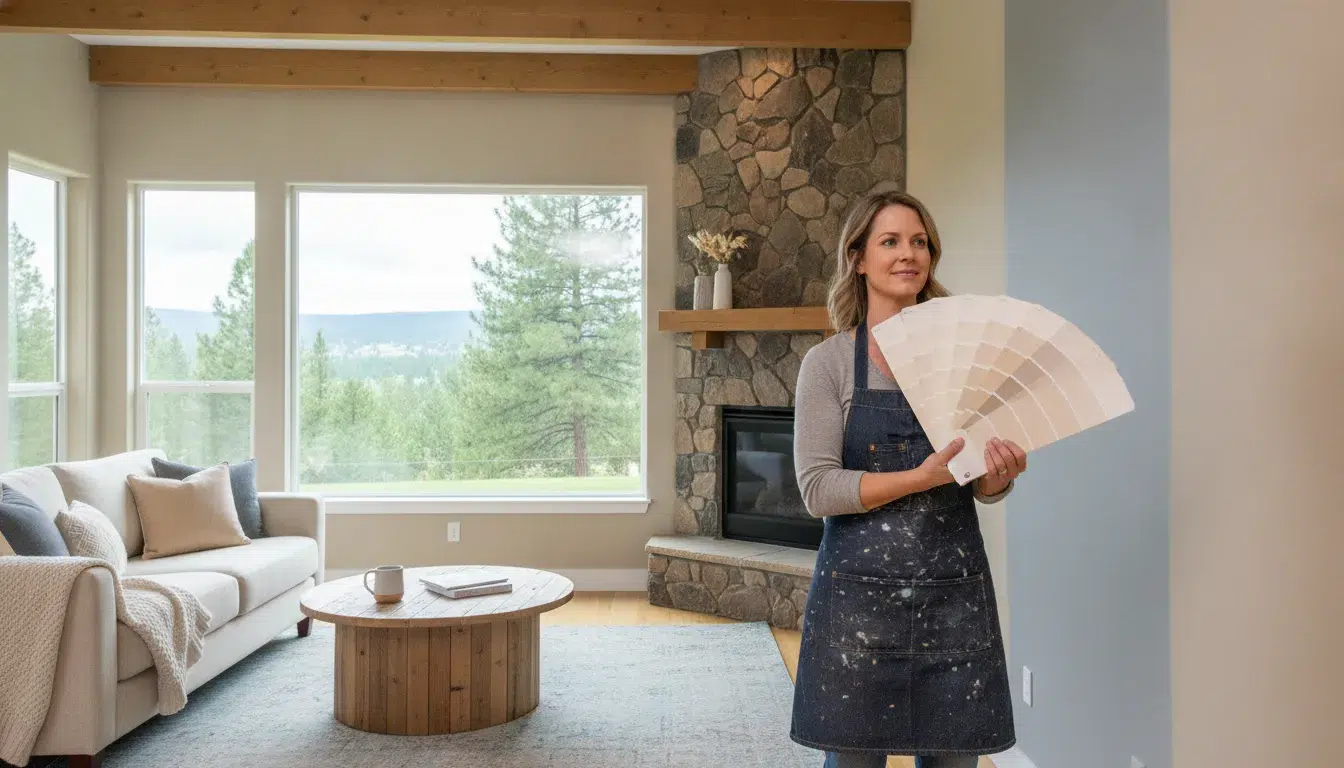
When one Boise room feels warm and inviting while the next looks disconnected, the problem may not be the individual colors. It is often the relationship between them, especially where open sightlines, hallways, and shared flooring make each wall part of a larger composition.
A home paint color palette Boise homeowners can use successfully usually starts with one flexible dominant color, a small group of related supporting shades, and a carefully limited accent. The right choices should work with fixed finishes, changing daylight, and the way rooms connect through doorways.
Color is not only decorative. Research shows that the luminance of a room’s bounding surfaces can influence how large or compact the space appears (National Center for Biotechnology Information). Before comparing swatches, it helps to understand how hue relationships, lightness, and saturation shape the palette you see.
Start With Color Theory Basics Before You Pick a Single Swatch
Color theory gives you a practical way to predict how a palette will feel before committing paint to every wall. It also helps you balance contrast, light, and visual weight across connected rooms.
The 60-30-10 rule explained
The 60-30-10 rule uses a dominant color across roughly 60% of the visual space, a secondary color across 30%, and an accent across 10%. The proportions are a flexible starting point, not a strict measuring exercise. In a home, the dominant color might cover most walls, while the secondary color appears through an adjoining room, cabinetry, textiles, or furniture. A smaller accent can bring energy to a door, built-in, artwork, or carefully chosen wall.
This framework keeps high-contrast colors from competing everywhere. The Interior Design Institute describes the rule as a way to create a balanced, professional-looking palette, while also discussing complementary. Analogous, and monochromatic schemes: opposite colors create energy, neighboring colors feel harmonious, and one color in varied shades feels refined. Learn more about these color theory principles.
Warm versus cool undertones
Warm neutrals such as cream, beige, and warm greige tend to feel comfortable and welcoming. Cool neutrals, including many whites and grays, can create a cleaner, airier impression. Undertones matter because two colors that look similar on a fan deck may feel noticeably different beside wood flooring, stone, or bright Boise daylight.
Saturation also changes the mood. A muted version of a hue is generally easier to carry through several rooms. While a highly saturated color makes a stronger statement and often works best in a focused area. Complementary colors can add lively contrast, but analogous colors offer a calmer transition when rooms are visible from one another.
| Characteristic | Warm neutrals | Cool neutrals |
|---|---|---|
| Feel | Comfortable and welcoming | Clean and airy |
| Typical undertones | Yellow, peach, beige | Gray, blue, subtle green |
| Works well with | Wood floors, fireplaces, natural textures | Stone, cool countertops, modern fixtures |
| Boise rooms that suit them | Cozy north-facing rooms | Bright south-facing spaces |
Why light reflectance value (LRV) matters
Light reflectance value, or LRV, indicates how much light a paint color reflects. It is useful when comparing colors because brightness affects more than mood. Research on perceived room layout found that the luminance of direct bounding surfaces, such as side walls, significantly influences how spacious a room appears. Read the research on luminance and perceived room size.
Use LRV as one decision point alongside undertone, natural light, and fixed finishes. A color that looks balanced in a sunny room may feel heavier in a dim hallway, so test samples before choosing the final palette.
How to Choose a Home Paint Color Palette That Flows Through Your Boise Home
A unifying neutral gives each room a shared visual foundation without making every space look identical. Start by deciding whether your Boise home suits a warm or cool neutral. Warm neutrals, such as cream, beige, and greige, tend to feel comfortable and welcoming. Cool neutrals, including clean white, gray, and cool off-white, can create a fresher, more expansive impression.
Let the fixed features of your home help guide that choice. Wood flooring, stone, tile, cabinetry, and large furniture pieces already contribute undertones to the space. A neutral that works with those elements will feel intentional, while one that fights them may make the room appear mismatched. Look at furniture and decor that continue from one room to the next, not just the pieces inside a single room.
Keep the whole-home palette focused
For a cohesive plan, limit the main palette to three to five colors. You can vary their intensity from room to room rather than introducing a completely different color in every space. For example, a soft neutral might anchor the living room, a deeper version could define a study, and a lighter variation could open up a hallway or bedroom.
This approach leaves room for personality while preserving continuity. Small rooms can carry more color when the surrounding spaces provide a calm visual connection. If you are updating an older Boise home, a fresh neutral base can also bridge traditional architectural details with newer furnishings.
Check the palette from connecting spaces
Do not evaluate each wall in isolation. Stand in the living room and look toward the dining area, then view those rooms through the connecting doorway. Colors that seem unrelated from this perspective can interrupt the flow, even when each room looks attractive on its own. Transitional spaces, especially hallways, work well as neutral bridges between rooms with distinct accents.
Light reflectance value, or LRV, is another useful checkpoint. LRV indicates how much light a paint color reflects, so it can influence how the neutral looks across rooms with different brightness levels. Test samples where you can see them from adjoining spaces before committing.
Once the palette is selected, careful preparation and consistent application matter as much as the color plan. Professional interior painting services can help create clean transitions and an even finish throughout the home.
Accent Color Strategies for Open-Concept Boise Homes
Open-concept rooms need contrast, but too many competing colors can make the layout feel disconnected. Start with a neutral dominant color as your canvas. Neutrals give furniture, artwork, and accessories room to change without forcing a full repaint whenever your style evolves.
Use the 60-30-10 approach across the connected floor plan rather than treating every area as a separate room. Let the dominant color cover roughly 60 percent of the visual field, including most walls. Use a secondary color for about 30 percent through an adjacent wall color, cabinetry, textiles, or larger furnishings. Reserve the final 10 percent for a focused accent in items such as artwork, an island, a fireplace wall, or selected built-ins.
Choose one focal point at a time
In an open layout, an accent wall works best when it gives the eye a destination. The main living area should establish the palette anchor before you choose stronger colors elsewhere. From that starting point, repeat the accent tone in smaller details across the kitchen, dining area, or entry so the spaces relate without looking identical.
Accent walls should be used sparingly. A focused wall can add personality and define a seating or dining zone. While several bold walls may interrupt the room’s flow or make the connected space feel closed in. For more direction, review these accent wall ideas before committing to a location.
Do not overlook the ceiling
Ceiling color is another way to shape an open room without adding a fourth wall color. A brighter ceiling can preserve an airy feeling, while a darker or higher-contrast shade can change the room’s height perception. Keep the ceiling choice connected to the dominant wall color and the amount of natural light the space receives.
Sample the full combination from several viewpoints, including the kitchen and hallways. The goal is a controlled progression: a neutral base, a supporting shade, and accents that guide attention while allowing the whole home to feel intentional.
Coordinate Your Palette With Flooring, Countertops, and Cabinetry
Paint should support the finishes that are already part of your home, not compete with them. Flooring, countertops, cabinetry, and fireplace surrounds all contribute color, undertone, texture, and visual weight to a room. Treat these permanent or difficult-to-change features as part of the palette before choosing wall color.
Start by identifying the dominant undertones. A wood floor may read warm, while a stone countertop can introduce cool gray, cream, or brown notes. Cabinets may be painted, stained, or mixed with another material, so view the entire combination together. The goal is not to match every finish exactly. It is to choose a wall color that creates a deliberate relationship between them.
Test against the fixed finishes first
Bring paint cards or sample containers home and hold them directly against the floor, cabinet doors, backsplash, and countertop. Check the samples in more than one location, especially where the light changes. A color that looks balanced beside one cabinet can appear noticeably different near a darker floor or reflective surface.
Whenever possible, place larger sample boards against the finishes rather than judging a small chip in isolation. Step back and view the combination from the doorway, since adjacent rooms need to look harmonious from different vantage points. This is especially useful in open layouts, where one wall color may sit beside several materials at once.
Furniture and decor matter, too. Look at the pieces that flow from room to room, including rugs, upholstery, artwork, and wood furniture. Your wall color should give those elements room to work together instead of creating a separate visual break in each space.
Trim provides another important transition. Standard white trim can create a clean outline around many wall colors. Matching or darker trim can produce a more dramatic effect, but it also changes how strongly the walls, doors, and cabinetry relate to one another. Review trim alongside your fixed finishes before finalizing the scheme.
How Boise’s Natural Light Changes Your Paint Colors
Paint does not look the same from sunrise to evening. In Boise, changing daylight can shift a color from crisp and bright in the morning to warmer or more muted later in the day. The city’s 2,730-foot elevation and more than 200 sunny days also mean many rooms receive strong natural light. While shaded rooms may depend more heavily on reflected or artificial light.
Start with the room’s actual light level. In spaces with limited natural light, lighter, brighter colors can reflect more of the available light and help the room feel more open. That does not mean every dim room needs stark white. A pale neutral with the right undertone can feel softer and more comfortable. For rooms with abundant sun, a color with moderate light reflectance may prevent the walls from feeling overly washed out.
Account for direction and time of day
Observe the walls you plan to paint in the morning, afternoon, and evening. A south-facing room may look very different from a north-facing room, and even two walls in the same room can receive noticeably different amounts of light. For more guidance, see our article on paint colors for north-facing rooms.
Boise’s seasonal contrast matters, too. Bright, long summer days and darker, overcast winter conditions can produce different impressions of the same color. If possible, assess your finalists in both seasonal conditions before committing to a whole-home palette.
Do not overlook your light bulbs
Artificial lighting changes paint perception after sunset. Warm bulbs around 2700K to 3000K can pull a color toward yellow or red. Cooler bulbs around 4000K to 5000K can emphasize blue undertones. Check samples under the bulbs you actually use, especially in bedrooms, hallways, and rooms with limited daylight.
Sample the paint on multiple walls rather than relying on a small card. Leave each sample in place long enough to view it at different times, and compare it beside flooring, trim, and furniture. The same testing habit helps when selecting Boise exterior paint colors, since outdoor light and surrounding surfaces can also change how the color reads.
Build Your Whole-Home Palette in Six Steps
A cohesive palette is easier to manage when you make decisions in a deliberate order. Start with the spaces that establish your home’s visual rhythm, then refine color, placement, and finish as you move through the house.
- Assess the light and fixed elements. Walk through each room at different times of day. Note natural light, flooring, countertops, cabinetry, fireplaces, and furniture that will remain. A color must work with these permanent features before it works on a sample card.
- Choose an anchor neutral for the main living areas. Begin with the largest or most connected spaces, since they define the palette for the rest of the home. Warm neutrals can feel welcoming, while cool neutrals often create a cleaner, airier impression. Your anchor should support the home’s architecture rather than compete with it.
- Extend three to five colors across connected rooms. Limit the main palette to three to five shades, then vary their intensity or placement for distinction. You might use one color for the dominant living areas, another for bedrooms, and a deeper version for selected features. Repeating colors helps rooms feel related without making every room identical.
- Use hallways and transitions as bridges. Consider how rooms appear through doorways, not only from inside each room. Hallways are useful places for a tying neutral that connects adjacent palettes. In open layouts, repeat a wall, trim, or accent color at natural boundaries rather than creating abrupt changes.
- Add bold accents last. Accent colors are most effective after the foundation is settled. Use them in a room that can handle their intensity, such as a well-lit study, powder room, or defined feature wall. A dark or highly saturated shade can make a small room feel enclosed when the space lacks enough light.
- Sample-test before committing. Paint large samples on multiple walls and observe them in morning, afternoon, and evening light. Test the proposed finish, too. Matte walls paired with semi-gloss trim can create subtle depth, even when both use the same color. If you want a second opinion, a color consultation can help you evaluate undertones, transitions, and finish choices before work begins.
Once the palette is settled, execution becomes the final design decision. Consistent coverage, clean lines, and an even finish matter more to the finished look than using a complicated or trendy combination.
Frequently Asked Questions
How many colors should a whole-home palette use?
Start with three to five main shades, then vary their intensity or placement from room to room. A consistent neutral can connect hallways and shared spaces, while one or two stronger colors add personality without making the home feel visually busy.
Will the same color look different in a north-facing room?
Yes. North-facing rooms typically receive cooler, less direct light, which can make some colors appear grayer or bluer. Test samples on more than one wall and observe them throughout the day before committing. Boise’s seasonal light also makes it useful to compare samples during bright summer and overcast winter conditions.
Should I match paint to my floors or cabinets first?
Use permanent finishes as your starting point. Flooring, countertops, cabinetry, tile, stone, and fireplace surrounds are difficult to change, so compare paint samples directly with them. Check the undertones, then make sure the selected colors also work with furniture and decor that flow between rooms.
What sheen should I use on walls and trim?
Wall and trim sheen should match the room’s function, cleaning needs, and desired look. A lower-sheen wall finish paired with a slightly more reflective trim finish can add subtle depth while keeping the palette unified. Your painter can recommend the finish combination after reviewing the surfaces.
Can a professional painter help me pick a palette?
Yes. A professional painter can help evaluate fixed finishes, room-to-room sightlines, natural and artificial light, sample placement, and finish choices before painting begins. That planning can reduce costly color changes and support a more cohesive result across the home.
Ready to Create a Palette That Flows?
A cohesive whole-home palette can make each room feel connected while still giving your Boise home its own character. Paint Boise can help you review color relationships, fixed finishes, and natural light before your project begins. Get a free estimate for your whole-home painting project, or call (208) 254-6615 to discuss your next steps.