Here in Boise, we have a deep appreciation for the natural world around us, from the rolling foothills to the winding river. It’s no surprise that so many of us want to bring that sense of peace and beauty into our homes. The good news is that current paint trends are perfectly aligned with that desire. The shift toward organic, earthy colors was a huge part of the interior wall paint trends 2021, and it has only grown stronger since. This article will show you how to use today’s most popular nature-inspired hues to create a serene, stylish, and comfortable home that reflects the beauty of the Treasure Valley.
Key Takeaways
- Align color with a room’s purpose: Intentionally shape your home’s atmosphere by choosing colors that support each room’s function, such as calming hues for bedrooms or inviting neutrals for social spaces.
- Draw inspiration from the outdoors: Create a serene and grounded home by using palettes inspired by nature. Earthy tones, soft greens, and warm whites help establish a peaceful and comfortable environment.
- Select a finish based on function: A paint’s sheen is critical for both durability and appearance. Match the finish to the room’s activity level, choosing washable options for busy areas and softer sheens for low-traffic zones.
What Are the Most Popular Interior Paint Colors?
Choosing the right paint color can feel like a huge decision, but it’s also one of the most exciting parts of a home refresh. The latest trends are all about creating a home that feels personal and comfortable. Whether you’re drawn to the warmth of earthy tones, the clean slate of a soft white, the tranquility of nature-inspired hues, or a pop of bold color, there’s a perfect shade waiting for you. Let’s look at the top color trends that are shaping interior design.
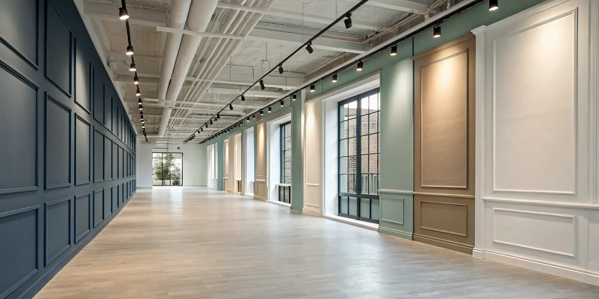
Warm neutrals and earthy tones
If you want your home to feel like a warm hug, this trend is for you. Earthy neutrals are moving away from cool grays toward cozier shades like beige and tan that create an inviting atmosphere. These colors are perfect for living rooms and family spaces, with versatile shades like Sherwin-Williams’ ‘Alabaster’ providing a grounding quality that connects your home to nature. Our team of expert interior painting professionals can help you select the perfect warm neutral to make your house feel more like home.
Soft whites and clean palettes
There’s a reason clean whites never go out of style. A soft white palette makes any room feel fresh, airy, and more spacious. Shades like Benjamin Moore’s ‘Pure White’ are fantastic for maximizing natural light and creating a serene backdrop that lets your furniture and artwork shine. This trend favors whites with a subtle warmth, giving you flexibility to change your decor over time. Getting that flawless finish is key, as imperfections can stand out, which is where our service guarantee provides peace of mind.
Calming blues and greens
Our homes are our sanctuaries, and paint can help create that sense of peace. Calming blues and greens are popular for spaces where you want to relax, like bedrooms and bathrooms. Hues like ‘Soft Sky’ or a muted ‘Sage Green’ are inspired by nature and can help reduce stress. These colors are gentle on the eyes and pair beautifully with natural wood tones and soft textiles. Many of our clients share in their reviews how a new coat of calming color transformed their personal spaces into peaceful retreats.
Bold accent colors
To make a statement, bold accent colors are the perfect way to inject personality into a room. This trend is all about strategic pops of color, like a deep teal accent wall or a vibrant burnt orange on a bookshelf to create a focal point. It’s a fantastic way to add drama and sophistication. This approach also works wonders on cabinetry. A fresh coat of a daring color can give your kitchen a high-impact update, a service our cabinet painters specialize in, turning something functional into a design feature.
Trending Colors from Top Paint Brands
If you want to know what’s next in home decor, look to the major paint brands. They put a ton of research into forecasting the colors that will define the year ahead, reflecting our collective mood and giving us a palette to create spaces that feel current and personal. Let’s see what Pantone, Sherwin-Williams, and Benjamin Moore are highlighting. Our team of expert interior painters loves helping Boise homeowners bring these fresh looks to life.
Pantone’s color harmonies
Pantone is a global authority on color, and their forecasts influence everything from fashion to home design. For the coming year, they are focusing on a beautiful balance between the natural world and our digital lives. Think of soft greens, muted blues, and warm, earthy neutrals that create a sense of calm and connection. The goal is to use color to build a tranquil atmosphere that supports mindfulness and well-being. These palettes are perfect for turning your home into a peaceful sanctuary, and you can explore their famous Color of the Year for even more inspiration.
Sherwin-Williams’ nature-inspired hues
Sherwin-Williams is doubling down on bringing the outdoors inside with its latest color trends. Their palette is filled with rich greens, warm terracottas, and gentle blues that echo the beauty of a forest floor or a clay pot. These nature-inspired hues are all about creating a space that feels grounded, serene, and connected to the environment. Colors like their popular “Evergreen Fog” or “Cavern Clay” can completely transform a room, making it feel like a cozy, natural retreat from the busy world. This trend is a wonderful way to make your home feel both stylish and restorative.
Benjamin Moore’s soothing shades
If your goal is to create a truly peaceful and comfortable home, you’ll love what Benjamin Moore is offering. Their trend forecast is all about soothing shades that promote rest and relaxation. The palette features soft pastels and muted tones, including gentle lavenders, soft blushes, and calming grays. These colors are ideal for bedrooms, reading nooks, or any space where you want to unwind. Shades like “Soft Fern” or “Pale Moon” have a quiet elegance that helps foster a sense of tranquility, turning your walls into a soft backdrop for a peaceful life.
Design Trends Influencing Paint Choices
Choosing a paint color is about so much more than just what’s popular. It’s about how you want to feel in your home. The biggest design trends are really reflections of our lifestyles, showing how we want our spaces to support our daily lives. As our homes continue to be the backdrop for everything from work to relaxation, we’re seeing a shift toward creating environments that are calming, flexible, and deeply personal. It’s less about following strict rules and more about using color to design a home that truly works for you.
These trends show a collective desire to connect with nature, make our rooms work harder, and express our unique personalities. Whether you’re drawn to earthy greens that remind you of a hike in the Boise foothills or need to carve out a visual nook for your home office, paint is one of the most powerful tools at your disposal. A thoughtful approach to your home’s color palette can completely transform your space. Our team of expert interior painting professionals can help you interpret these trends and apply them in a way that feels authentic to your home and style.
Bringing the outdoors in with biophilic design
If you’ve ever felt instantly calmer in a room filled with plants and natural light, you’ve experienced biophilic design. This trend is all about strengthening the connection between your home and the natural world. For paint, this translates to a palette of earthy, organic colors. Think soft greens, warm browns, sandy beiges, and other muted tones that mimic the tranquility of nature. These colors work beautifully to create a serene and grounding atmosphere, turning rooms into peaceful retreats. It’s a wonderful way to bring a sense of balance and well-being into your everyday living spaces.
Creating multi-functional spaces
These days, our rooms have to wear many hats. Your living room might also be your office, and your guest room might double as a workout space. This need for flexibility has inspired a clever use of color to define different zones within a single room. A light, neutral paint color can make the overall space feel open and adaptable. Then, you can use a darker or contrasting shade on a specific wall or in a nook to visually separate a work area from a relaxation spot. It’s an effective way to create distinct “rooms within a room” without putting up a single wall, and our house painters are experts at creating these seamless transitions.
Using accent walls as a focal point
The accent wall is a classic for a reason: it’s a fantastic way to add a splash of personality and create a stunning focal point without overwhelming a room. This is your chance to be bold and experiment with a color you love but might be hesitant to use on all four walls. A deep, dramatic color behind your headboard can make a bedroom feel cozier, while a bright, energetic hue in the living room can highlight a favorite piece of art or architectural feature. An accent wall draws the eye, adds depth, and serves as a powerful expression of your personal style.
Exploring textured finishes
Ready to add another dimension to your walls? Textured finishes are gaining popularity for the unique character and tactile interest they bring to a room. Techniques using specialty paints can create subtle effects that catch the light in beautiful ways, adding warmth and depth that a flat color simply can’t match. Beyond aesthetics, textured finishes have a practical side too. They are excellent for hiding minor imperfections in older walls, giving them a fresh and flawless appearance. Because achieving a professional look requires skill, this is a great project to entrust to a team that backs their work with a service guarantee.
How Does Paint Color Affect a Room’s Mood?
Paint is one of the most powerful tools in interior design, and it goes far beyond just covering a wall. The colors you choose have a direct psychological impact, influencing the energy and overall feeling of a room. Think of it as setting the stage for your life. Do you want a space that feels restful and calm, or one that’s vibrant and full of energy? The right paint color can make all the difference.
Choosing a color isn’t just about following trends; it’s about creating an environment that supports how you want to feel in your home. A fresh coat of paint is a relatively simple change that delivers a huge return in atmosphere and personal comfort. By understanding how different colors work, you can intentionally design each room to serve its purpose and reflect your personality. Let’s explore how you can use color to shape the mood of your home.
Create calm with blues, greens, and soft grays
If you want to turn a room into a peaceful retreat, look to the cooler side of the color wheel. Soft blues, gentle greens, and muted grays are known for their calming effects. These colors often remind us of nature, like a clear sky or a quiet forest, which helps lower stress and create a sense of tranquility. They are a perfect choice for bedrooms, bathrooms, or any space where you want to relax and unwind after a long day. A serene sage green or a dusty light blue can make a primary bedroom feel like a true sanctuary. Our expert interior painting team can help you achieve a flawless finish that enhances this peaceful atmosphere.
Energize your space with yellows and warm accents
When you need a little more pep in your step, warm and vibrant colors are the way to go. Bright yellows, cheerful oranges, and even rich terracotta tones can infuse a room with energy and optimism. These colors are associated with sunshine and warmth, making them fantastic for spaces where activity and creativity happen. Consider a sunny yellow for your kitchen to make mornings feel brighter, or use a bold accent wall in a home office to inspire focus and enthusiasm. You don’t have to paint the entire room a bright color; even small doses in an otherwise neutral space can add a welcome pop of personality and joy.
Build warmth with neutrals and earthy tones
For a room that feels cozy, inviting, and grounded, you can’t go wrong with earthy neutrals. Shades like taupe, beige, warm grays (or “greige”), and soft browns create a comfortable and stable environment. These colors are incredibly versatile and provide a beautiful, warm backdrop that lets your furniture, artwork, and decor shine. They are ideal for living rooms and dining areas where you want to encourage conversation and connection. An earthy color palette makes a space feel like a warm hug, welcoming you and your guests the moment you walk in. It’s a timeless approach that reflects the kind of trustworthy and welcoming service we aim to provide at Paint Boise.
Match the color to the room’s purpose
Ultimately, the best way to choose a paint color is to think about the primary function of the room. What do you do there most often? A bedroom is for rest, so calming blues and greens are a natural fit. A kitchen is often a hub of activity, making an energizing yellow or a clean, crisp white a great choice. For a living room where you both relax and entertain, a warm, inviting neutral might be the perfect compromise. By aligning the color with the room’s purpose, you create a more functional and harmonious home. If you need help bringing your vision to life, our professional house painters are always here to guide you.
How to Choose the Right Paint Finish
Once you’ve finally landed on the perfect color, it feels like the hard part is over. But there’s one more crucial decision to make: the finish. The paint’s finish, or sheen, affects not only how the color looks on your walls but also how durable and easy to clean it is. Think of it as the final piece of the puzzle that ties the whole room together. Choosing the right one is about balancing aesthetics with practicality. A high-gloss finish might look stunning on a sample chip, but it will highlight every tiny imperfection on a large wall. On the other hand, a flat, matte finish that hides flaws beautifully might not stand up to the sticky fingerprints in a busy hallway.
The key is to match the finish to the room’s function and the lifestyle of your family. A busy kitchen with splatters and steam has very different needs than a quiet, formal dining room. We’ll walk through the most common options, from velvety matte to shiny semi-gloss, so you can understand the pros and cons of each. This will help you select a finish that not only looks great on day one but also holds up for years to come, keeping your home looking fresh and clean. Making the right choice now saves you from frustrating touch-ups and premature repainting down the road.
Your finish options: matte, eggshell, satin, and semi-gloss
Let’s break down the four most common paint finishes you’ll encounter. Matte (or flat) has no shine and is excellent at hiding surface imperfections, making it ideal for ceilings and low-traffic adult bedrooms. Next up is eggshell, which has a soft, low-sheen glow like its namesake. It’s a bit more durable than matte and works well in living rooms.
Satin offers a smooth, velvety look with a bit more sheen, and it’s a popular choice because it’s durable enough for high-traffic areas like hallways and kids’ rooms. Finally, semi-gloss has a noticeable shine and is highly durable and moisture-resistant. This makes it perfect for trim, doors, and kitchen or bathroom walls that need frequent cleaning.
Match the finish to the room’s traffic
The easiest way to choose a finish is to think about how much action the room sees. For high-traffic zones like hallways, entryways, and family rooms, you need a finish that can handle scuffs and be wiped down easily. A satin finish is your best friend here. It strikes the perfect balance between being washable and not having too much distracting shine.
For rooms with less foot traffic, like a formal dining room, office, or master bedroom, you can prioritize appearance over durability. An eggshell or even a matte finish will provide a rich, uniform look that feels sophisticated and calm. These lower-sheen finishes are less forgiving to scrubbing, but in a space that doesn’t see a lot of wear and tear, they create a beautiful, soft backdrop for your decor.
Test colors before you commit
A paint finish can dramatically change how a color appears on your wall. Higher-sheen finishes like satin and semi-gloss reflect more light, which can make a color look slightly lighter and more intense. Matte finishes, on the other hand, absorb light and give colors a softer, more muted appearance. This is why you should always test your paint in the exact finish you plan to use.
Grab a sample pot and paint a large swatch directly on the wall, or on a piece of poster board you can move around the room. Observe it throughout the day as the light changes. That perfect greige you loved at the store might look completely different in your north-facing living room. Testing your paint is a small step that prevents big, costly mistakes.
The importance of prep and proper application
You can choose the most expensive paint and the perfect finish, but if the wall underneath isn’t properly prepared, the final result will be disappointing. A beautiful paint job is built on a foundation of good prep work. This means cleaning the walls to remove dust and grime, patching any holes or cracks, and sanding the surface smooth. For most jobs, applying a quality primer is also essential. Primer helps the paint adhere better and ensures the color looks even and true.
This is often the most time-consuming part of any painting project, and it’s where many DIY efforts fall short. Taking the time to prep correctly ensures your new paint will go on smoothly and last for years, giving you that professional look we all want. It’s a testament to our commitment to quality that we spend so much time on what’s underneath.
When to hire a professional interior painter
If all this talk of sanding, priming, and choosing the right sheen feels overwhelming, it might be time to call in a professional. A DIY paint job can quickly spiral into a multi-weekend project, especially if you have high ceilings, intricate trim, or walls that need significant repairs. Hiring an expert interior painter saves you time, stress, and the physical labor of the job.
Professionals have the tools, experience, and techniques to handle the prep work efficiently and apply the finish flawlessly. We can get the job done quickly with minimal disruption to your life, and you can rest easy knowing the result will be crisp, clean, and beautiful. Plus, with a professional service, you get the peace of mind that comes with a service guarantee, ensuring a perfect finish you’ll love.
Related Articles
- Creative Wall Painting Ideas for Every Room
- Wall Painting for Living Room: A Complete Guide
- Painting Ceiling and Walls Same Color: The Pro Guide
- How to Choose the Perfect Exterior Paint Color for Your Home
- 10 Best Exterior Paint Colors for Residential & Commercial Buildings
Frequently Asked Questions
How do I choose the right white paint? There are so many options! Choosing a white paint can feel surprisingly complex, but it really comes down to undertones. Hold a few paint chips against a plain white piece of paper to see if the color leans warm (yellow, pink), cool (blue, gray), or is a true neutral. A warm white creates a cozy, inviting feel, while a cool white looks crisp and modern. The best way to decide is to paint large sample swatches in the room and see how they look in the morning, afternoon, and evening light.
I love the idea of a bold color but I’m afraid to commit. Any advice? You don’t have to paint an entire room to enjoy a bold color. Start small to build your confidence. An accent wall behind your sofa or bed is a perfect way to make a statement without overwhelming the space. You could also try painting a smaller, separate area like a powder room, the inside of a bookshelf, or even a single piece of furniture. This gives you a pop of personality that’s easy to change later if you want.
What’s the most durable and easy-to-clean paint finish for a busy household? For homes with kids, pets, or just a lot of activity, a satin finish is your best bet for walls in hallways, kitchens, and family rooms. It has a subtle sheen that is durable enough to be wiped down repeatedly without damaging the paint. For trim, doors, and cabinets that take even more abuse, a semi-gloss finish is even tougher and easier to clean, providing excellent resistance to moisture and daily wear.
My room doesn’t get much natural light. What colors should I consider or avoid? In a room with limited natural light, dark or highly saturated colors can make the space feel smaller and more enclosed. It’s generally best to stick with lighter, brighter colors that help reflect light and create a more open, airy feeling. Soft whites, pale grays, and light pastels are all excellent choices. You can also consider using a satin finish, as its slight sheen will help bounce light around the room more than a flat or matte finish.
How important is primer, really? Think of primer as the essential foundation for a beautiful, long-lasting paint job. It’s not a step you want to skip. Primer ensures your new color looks true and vibrant, prevents old stains or dark colors from bleeding through, and helps the paint stick to the wall properly. A properly primed surface results in a smoother, more uniform finish that will look better and last much longer, saving you from having to repaint sooner than you’d like.