For years, the standard rule for interior painting has been to keep ceilings a crisp, clean white. But what if breaking that rule was the secret to a more sophisticated and thoughtfully designed space? Enter color drenching. This technique uses the same walls and ceiling color to wrap a room in a single, beautiful hue. By erasing the hard line where the wall meets the ceiling, you create a seamless, immersive experience. Your eye travels upward without interruption, making a room feel instantly taller, cozier, and more unified. We’ll show you how this simple choice can hide imperfections and create a truly intentional look.
Key Takeaways
- Create a seamless look with one color: Painting your walls, ceiling, and trim the same shade is a technique called color drenching. It’s a powerful way to make a room feel more spacious and intentional or to create a cozy, enveloping vibe.
- Choose your color and finish wisely: The right shade and sheen are everything for this look. Always test colors in your room first, and consider using a flat finish on the ceiling with an eggshell or satin on the walls to create subtle, sophisticated contrast.
- Don’t skip the prep work: A flawless finish starts long before you open the paint can. Proper preparation, which includes cleaning surfaces, patching imperfections, and taping edges, is the most important step for achieving professional-quality results that last.
So, What Is Color Drenching?
If you’ve ever seen a room where the walls, ceiling, and even the trim are all painted the same beautiful color, you’ve experienced color drenching. This design technique involves wrapping a room in a single hue to create a cohesive, modern, and immersive feel. Instead of a standard white ceiling that visually chops up the space, color drenching blurs the lines between surfaces. The result is a bold, intentional look that can make a room feel more spacious and thoughtfully designed.
This approach works with almost any color, from soft neutrals to deep, moody shades. By eliminating the usual contrast between walls and trim, the focus shifts to the room’s architecture, furniture, and decor. It’s a powerful way to make a statement and is a project our expert interior painting team loves to bring to life. The transformation is always dramatic, turning a standard room into a sophisticated, unified space. It’s a fantastic choice for living rooms, bedrooms, and even home offices where you want to create a distinct mood without adding clutter. The uniform color provides a clean backdrop that makes your art and furnishings pop.
How a Single Color Changes the Feel of a Room
Color has a major impact on our mood, and drenching a room in one shade amplifies that effect. When you’re surrounded by a single color, the atmosphere becomes much more immersive. A room drenched in a soft blue can feel incredibly calming and serene, while a deep green creates a cozy, protective den-like vibe. This technique allows you to set a very specific tone. By removing the visual distraction of different colors, you let the personality of your chosen hue take center stage, creating a space that feels truly intentional and emotionally resonant.
The Secret to a Flawlessly Seamless Look
The magic of color drenching lies in its ability to create a seamless visual experience. Traditionally, a white ceiling acts as a cap on a room, drawing a clear line where the walls end. When you paint the ceiling the same color as the walls, that line disappears. Your eye travels upward without interruption, which creates the illusion of height and makes the entire space feel more open and expansive. This is an especially effective trick in smaller rooms or rooms with lower ceilings, as it removes the visual boundaries that can make a space feel confined.
Thinking of the Ceiling as the ‘5th Wall’
Designers often refer to the ceiling as the “5th wall,” and for good reason. It’s a large, uninterrupted surface that has a huge impact on how a room feels. When you treat it as an integral part of the design instead of an afterthought, you can completely change the space. Painting the ceiling the same color as the walls is a popular trend that makes a room feel like one smooth, continuous space. This approach creates a unified look that feels both intentional and sophisticated. Our expert interior painting team has seen firsthand how this technique can make a room feel bigger and more open, as if the walls and ceiling are floating. It’s a simple change in perspective that delivers a high-impact, professional result.
Why You’ll Love a Color-Drenched Room
Color drenching is more than just a design trend; it’s a powerful tool for transforming the feel of a room. By using a single color across walls, ceilings, and trim, you can create a cohesive and intentional space. This technique offers several surprising advantages, from manipulating the perception of a room’s size to creating a specific mood. Let’s explore how this bold approach to paint can work for your home.
Make a Small Room Feel Instantly Bigger
If you have a room that feels a bit cramped, color drenching can be your secret weapon. Painting the ceiling the same color as the walls makes the boundaries of the room seem to disappear. Without a stark white ceiling stopping your gaze, the lines blur, creating a more expansive and open feeling. This seamless effect tricks the eye into seeing one continuous surface, which can make a small bedroom, bathroom, or office feel surprisingly spacious. It’s a simple way to make the most of your square footage without any major renovations, just a clever coat of paint.
Create a Cozy, Enveloping Atmosphere
On the flip side, color drenching is perfect for making a space feel more intimate and cozy. Wrapping a room in a single, continuous color creates a comforting, cocoon-like effect. This is especially true with medium to dark shades, which can add a touch of drama and sophistication. Imagine a reading nook or a dining room enveloped in a rich, warm hue. The unified color scheme fosters a sense of calm and togetherness, making it the perfect backdrop for relaxing with a book or entertaining guests in a warm, inviting atmosphere.
Seamlessly Hide Bumps and Imperfections
Have a ceiling with awkward angles, exposed beams, or a few imperfections? Color drenching is an excellent way to make them less noticeable. When the ceiling is painted a contrasting color, it draws attention to every bump and unique shape. By painting it the same color as the walls, you create a uniform look that helps those features blend in. This technique simplifies the room’s architecture, resulting in a cleaner, more polished appearance that feels intentional and well-designed. It’s a smart fix for older homes or basements with lots of ductwork.
Give the Illusion of Higher Ceilings
One of the most popular benefits of color drenching is its ability to make ceilings feel taller. This painting trick works by drawing your eyes upward without an abrupt break in color at the ceiling line. The continuous color creates a vertical illusion, making the walls seem to stretch higher than they actually are. It’s a simple yet effective strategy used in expert interior painting to add a sense of grandeur and openness to rooms with standard or even low ceilings.
Highlight Architectural Features
Color drenching gives you the power to decide what stands out in a room. By painting everything—walls, trim, and ceiling—the same color, you create a unified canvas. This allows the unique shapes and lines of your home’s architecture, like crown molding, built-in bookshelves, or an arched doorway, to become the main event. Instead of being broken up by contrasting colors, these features are celebrated for their form. The single hue provides a sophisticated, uncluttered backdrop that shifts the focus to the room’s structure and your decor. It’s a technique our professional painters use to create a high-end, intentional look that makes architectural details feel like an integral part of the design.
How Your Color Choice Sets the Vibe
Choosing the right color is the most important part of planning your color-drenched room. The shade you pick will single-handedly define the space’s personality, so it’s worth taking the time to think about the mood you want to create. Do you want a room that feels bright and expansive, or are you aiming for something more dramatic and intimate? The color on the walls and ceiling will be the foundation for the entire vibe. Let’s look at how different color families can transform your space.
Choosing Light Colors for an Airy Feel
If you want to make a room feel bigger and brighter, light colors are your best friend. Shades like soft whites, pale grays, beiges, and pastels are fantastic at reflecting light. This simple trick creates an illusion of openness, making them a perfect choice for smaller rooms, narrow hallways, or any space that doesn’t get much sun. An expert interior painting job using a light, single-color scheme can make a cramped room feel instantly more spacious and welcoming. This approach gives you a clean, fresh canvas that feels both modern and timeless.
Designer Picks for Light Ceilings
So, which light colors are foolproof for this look? You can’t go wrong with a soft, creamy white or a very light beige. These shades are warmer than a standard ceiling white and create a gentle, luminous glow that makes any room feel inviting. For a more modern take, a pale gray with a warm undertone works beautifully, adding a touch of sophistication without closing in the space. If you want a subtle hint of color, consider a whisper-soft blue or a muted sage green. Our team of house painters often recommends these shades because they provide a clean backdrop that complements any decor style while still making the room feel open and bright.
Using Dark Hues for Drama and Coziness
Don’t be afraid of the dark. Deep, saturated colors like navy blue, charcoal gray, or emerald green can bring a sense of drama and sophistication to a room. Wrapping the walls and ceiling in a dark shade creates a cozy, enveloping feel that’s ideal for bedrooms, dining rooms, or a home library. The key is to make sure the room has enough natural or artificial light to keep it from feeling too heavy. When done right, a dark, color-drenched room feels intentional, luxurious, and incredibly intimate. Our professional house painters can help you find the perfect dark shade that complements your home’s lighting.
Picking Neutrals for a Timeless Look
For a look that is calm, collected, and effortlessly stylish, you can’t go wrong with neutrals. Colors like taupe, greige, and soft, warm grays offer a serene and timeless backdrop that complements any decor style. These shades are incredibly versatile, allowing your furniture, art, and textiles to take center stage. A neutral color-drenched room feels balanced and peaceful, making it a great option for living rooms and open-concept spaces. It’s a sophisticated choice that won’t go out of style, providing a soothing atmosphere you’ll love for years to come.
Designer Picks for Neutral Ceilings
When you’re ready to commit to a neutral, the sheer number of options can be overwhelming. To narrow it down, we often suggest starting with a few tried-and-true favorites. A warm greige is a fantastic choice because it blends the best of gray and beige, creating a color that feels both modern and inviting. For a slightly brighter but still soft look, consider a creamy off-white, which avoids the starkness of pure white while keeping the space feeling open. Another beautiful option is a soft taupe, which has subtle earthy undertones that bring a sense of calm and grounding to a room. Our expert interior painting team can help you sample these shades in your own space to see how they interact with your lighting and decor, ensuring you find the perfect one.
Don’t Skip This Step: Always Test Your Colors
Here’s a pro tip I share with everyone: always test your paint colors in the actual room before committing. A color can look completely different on a tiny paint chip in a store versus on your wall at home. As Architectural Digest explains, it’s essential to see how the light affects the hue throughout the day. Paint a few sample swatches on different walls and observe how they change as the sun moves. This step is the single best way to make sure you’ll love the final result and avoid any color surprises.
When to Stick with a Classic White Ceiling
While I’m a huge fan of the color drenching trend, I’ll be the first to admit it’s not the right choice for every room. Sometimes, the classic, crisp white ceiling is still the best way to go. It’s a timeless choice for a reason, and in certain situations, it works harder than any other color. If your room has specific challenges, like a lack of natural light, or if you’re already making a bold statement with your wall color, a white ceiling can be the perfect supporting player. It’s all about understanding your space and your design goals to make the smartest choice for your home.
Brighten Up a Dark Room
If you have a room that doesn’t get much natural light, a white ceiling is your best friend. White is incredibly effective at reflecting light, whether it’s from a window or a lamp. As the experts at Matthews Painting note, using white helps bounce light around, making the entire room feel brighter and more open. This is a go-to strategy for north-facing rooms, basements, or any space that feels a bit gloomy. Instead of absorbing precious light, a white ceiling works to amplify it, creating a more cheerful and inviting atmosphere without having to add more fixtures.
Balance Bold Wall Colors
Have you fallen in love with a deep, moody green for your walls or decided on vibrant navy for your kitchen cabinets? In that case, a white ceiling is the perfect way to create balance. When you have a strong color on the walls, a white ceiling provides a clean, crisp contrast that allows the bold hue to be the star of the show. It prevents the room from feeling too heavy or overwhelming and keeps the space feeling fresh. This is a great approach if you’re investing in a statement look with our cabinet painting services and want to ensure your new color truly pops.
Hide Imperfections and Fixtures
Ceilings, especially in older homes, can have their share of minor imperfections, from subtle drywall tape lines to slight waviness in the plaster. A flat or matte white paint is exceptionally good at hiding these little flaws. Because it doesn’t reflect much light, a matte finish absorbs it, making bumps and dips less noticeable. As one homeowner on Reddit pointed out, a shinier paint will highlight every imperfection. A classic white ceiling also helps things like smoke detectors, vents, and light fixtures blend in, creating a cleaner, less cluttered visual field overhead.
Alternative Ceiling Color Strategies
If you’re intrigued by the idea of a painted ceiling but not quite ready to drench your room in a single color, don’t worry—there’s a beautiful middle ground. You don’t have to choose between all-in color or plain white. Playing with different shades of your wall color on the ceiling can create a sophisticated, custom look that achieves a specific design goal, whether that’s making the room feel more open or cozier. These alternative strategies offer a subtle twist on tradition and can add a layer of professional polish to your space.
Go Lighter for an Open, Airy Vibe
One of my favorite designer tricks is to paint the ceiling a lighter version of the wall color. You can do this by asking your paint store to mix a version of your wall color with 50% white. This creates a soft, subtle contrast that is less jarring than stark white but still helps the room feel open and airy. This technique gently draws the eye upward, giving the illusion of height without a hard stop. It’s an excellent choice for rooms with lower ceilings, as it provides a gentle lift and makes the space feel larger and more breathable.
Go Darker for a Cozy, Dramatic Effect
On the other hand, if you have a room with very high ceilings, painting the ceiling a shade or two darker than the walls can have a stunning effect. This strategy can make a large, cavernous space feel cozier and more intimate by visually lowering the ceiling. It adds a touch of drama and architectural interest without the full commitment of a dark, color-drenched room. This is a fantastic option for a primary bedroom with a vaulted ceiling or a two-story great room, creating a more grounded, human-scale atmosphere. We often use this technique in our commercial painting projects to make large lobbies or restaurants feel more inviting.
How to Choose the Right Paint Finish
Choosing the right color is only half the battle; the paint finish, or sheen, is just as crucial for getting your color-drenched room right. The finish determines how much light the paint reflects and how durable the surface will be. A high-sheen paint will highlight every tiny bump and flaw, while a lower-sheen paint is much more forgiving. When you’re using one color across multiple surfaces, playing with different sheens is the secret to adding depth and character to the space. It’s a subtle trick that makes a huge difference in the final result. Think of it as creating texture with paint. By selecting the right finish for each surface, you can achieve a cohesive look that feels intentional and professionally designed, ensuring your walls, ceiling, and trim work together beautifully.
Selecting the Right Type of Paint
Beyond the sheen, the actual formulation of the paint you choose plays a huge role in the final outcome and the longevity of your project. Modern paints are more than just color in a can; they’re engineered with specific properties to meet different needs. Whether it’s prioritizing indoor air quality, ensuring the surface is easy to clean, or getting that perfectly smooth application, the type of paint you select matters. This is a step where professional expertise really shines, as knowing which formulation works best for a specific surface and environment is key to a durable, beautiful finish that stands the test of time.
Low-VOC, Acrylic, and Washable Options
When you’re at the paint store, you’ll see terms like Low-VOC, acrylic, and washable. Let’s break them down. Low-VOC (Volatile Organic Compound) paints are a fantastic choice for interiors because they release fewer chemicals into the air, making your home healthier to breathe in during and after painting. Most high-quality wall paints today are acrylic-based, which is great news because they are easy to work with, have a low odor, and provide excellent coverage. For rooms that see a lot of action, like kitchens or playrooms, consider a washable paint. As some modern paint trends show, these durable options make it easy to wipe away smudges and stains without damaging the finish, keeping your color-drenched walls looking fresh.
What’s the Best Sheen for Your Ceiling?
When it comes to ceilings, a flat or matte finish is almost always the best choice. These finishes absorb light rather than reflecting it, which does two wonderful things. First, it hides imperfections like cracks, patches, or uneven texture, giving your ceiling a smooth, uniform appearance. Second, it prevents any distracting glare from overhead lighting. A shiny ceiling can feel unsettling and draw attention away from the rest of your beautiful room. Using a flat finish creates a soft, velvety look that helps the ceiling recede, making the space feel calm and complete. It’s the standard for a reason and provides the perfect canvas for your color-drenched design.
And What About Your Wall Finish?
For walls, you’ll want a bit more durability than a flat finish can offer. The most popular choices are eggshell and satin. An eggshell finish has a very subtle, low luster that’s great for living rooms, dining rooms, and bedrooms. It’s more durable and easier to clean than a flat finish but still does a good job of hiding minor imperfections. If you need something tougher for high-traffic areas like hallways, kitchens, or bathrooms, a satin finish is an excellent option. It has a slightly higher sheen and is much easier to wipe down. Our expert interior painting team can help you decide which finish is best suited for your lifestyle and the specific room you’re painting.
How to Play with Sheen for Subtle Contrast
Here’s a pro tip for making your color-drenched room truly stand out: use the same color everywhere but vary the sheen. This technique creates a sophisticated, layered look without introducing another color. A classic and effective combination is to use a flat finish on the ceiling, an eggshell or satin finish on the walls, and a semi-gloss finish on the trim, doors, and window frames. The slight shine of the semi-gloss on the trim will catch the light, creating a subtle contrast that beautifully defines the architectural details of the room. This approach gives the space a polished, high-end feel and adds visual interest that keeps the single-color palette from feeling flat.
Modern Ceiling Design Trends to Consider
While color drenching offers a beautifully cohesive look, it’s not the only way to make your ceiling a star. If you’re not quite ready to commit to a single color for the entire room, there are plenty of other modern approaches that treat the ceiling as the “fifth wall.” Moving beyond basic white can add personality, depth, and character to any space. These trends range from subtle and sophisticated to bold and artistic, giving you the freedom to find a style that perfectly matches your home’s aesthetic and the mood you want to create. Thinking of your ceiling as a blank canvas opens up a world of design possibilities that can completely transform a room from the top down.
From creating architectural interest with clever color placement to turning the entire surface into a work of art, the right ceiling treatment can be a game-changer. Trends like two-tone designs, soft pastels, and even custom murals are becoming more popular as homeowners look for unique ways to express their style. Combining paint with features like cove lighting can also add a layer of luxury and ambiance. Our expert interior painting team can help you explore these creative options, ensuring the final result is a flawless and stunning focal point that you’ll love looking up at for years to come.
Elegant Two-Tone Ceilings
A two-tone ceiling is a fantastic way to add architectural interest and depth to a room without any construction. This technique involves using two complementary colors, often a lighter shade for the main ceiling area and a slightly darker one for the edges or a recessed section. For example, you could pair a soft cream with a muted mint green or use two shades from the same color family to create a subtle, layered effect. This approach draws the eye upward and can create the illusion of a tray ceiling, making the room feel more custom and thoughtfully designed. It’s a sophisticated choice that adds a touch of elegance and visual structure.
Statement Ceiling Murals
For those who want to make a truly unique and personal statement, a ceiling mural transforms the entire surface into a piece of art. This is your chance to get creative. Imagine a dreamy cloudscape in a bedroom, a lush botanical pattern in a sunroom, or a bold abstract design in a modern living space. A mural turns the ceiling into the room’s main focal point, creating a one-of-a-kind atmosphere that reflects your personality. Because this requires a high level of detail and precision, it’s a project best handled by professional house painters who can execute your vision flawlessly and create a stunning masterpiece overhead.
Soft Pastel Ceilings
If you’re looking for a gentle way to introduce color, consider painting your ceiling a soft pastel. Hues like blush pink, light lavender, mint green, or a barely-there blue can create a calm and inviting atmosphere. These light, airy colors are perfect for making a room feel larger and more open, as a pale blue ceiling can subtly mimic the feeling of a clear sky. This trend works beautifully in bedrooms, nurseries, and bathrooms, where a serene and tranquil vibe is often desired. When paired with neutral walls, a pastel ceiling offers a delicate pop of color that feels fresh, modern, and incredibly soothing without being overwhelming.
Cove Lighting and Painted Ceilings
Combining a beautifully painted ceiling with cove lighting is a surefire way to add a touch of luxury and ambiance to any room. Cove lighting involves placing LED strips in a hidden ledge or recess, which casts a soft, indirect glow across the ceiling. When this light washes over a freshly painted surface, it enhances the color and creates a warm, inviting atmosphere. You can tailor the effect by pairing warm white LEDs with earthy tones like cream or sand, or cool white LEDs with blues and greens. This combination highlights your color choice and gives the room a high-end, professionally designed feel, perfect for dining rooms, living rooms, or primary suites.
Common Color Drenching Mistakes (and How to Avoid Them)
Color drenching is a bold design choice, but its success hinges on getting the details right. While wrapping a room in a single hue can create a stunning, cohesive look, a few common missteps can leave you with a space that feels off instead of inviting. The goal is to create a sophisticated and intentional atmosphere, not an overwhelming one that you’ll tire of quickly. It’s about more than just picking a color you love; it’s about understanding how that color will interact with the unique characteristics of your room, from the height of the ceiling to the direction the windows face. Think of it as a holistic approach to painting. Every surface works together to create a single, immersive experience. When done correctly, it can make a room feel bigger, cozier, or more dramatic. But when a key element is overlooked, the entire effect can fall flat. We’ve seen it all, and we want to help you sidestep the common pitfalls so your project is a success from the first brushstroke. Paying attention to these details will make the difference between a design triumph and a project you regret. Let’s walk through the mistakes to avoid to ensure your color-drenched room is everything you imagined.
Going Too Dark for the Space
While deep, moody colors can create a wonderfully dramatic and cozy space, going too dark without the right environment can backfire. A very dark color used across every surface, including the ceiling, can make a room feel smaller and more cave-like than you intended, especially if it’s a space you use during the day. As a general rule, dark colors on the ceiling might not look as good as lighter ones. If your heart is set on a deep jewel tone or a rich earthy shade, consider it for a room with high ceilings or plenty of windows to balance the intensity. This allows the color to feel enveloping and luxurious rather than oppressive.
Forgetting to Factor in Natural Light
The amount of natural light a room receives is one of the most critical factors in color drenching. A color that looks soft and airy in a sun-filled space can appear dull and heavy in a room with limited light. This painting technique works best in rooms that get a good amount of natural light because it helps the single color feel expansive rather than confining. Before you commit, spend a full day observing how the light moves through your room. Notice how your potential color choice shifts from morning to afternoon to evening. This will give you a true sense of how the color will live in your space and prevent any unwelcome surprises once the paint is on the walls.
Skipping the All-Important Sample Step
This might be the most important tip of all: always test your paint. Colors can look completely different online, in the store, and on your walls. The undertones can shift dramatically depending on your room’s lighting, flooring, and even the furniture. It’s essential to sample the paint in your space to see how the light affects its hue throughout the day. Paint large swatches on different walls and a spot on the ceiling. Live with them for a few days before making a final decision. This small step saves you from the costly mistake of repainting an entire room and ensures you’ll love the final result.
Choosing the Wrong Paint Finish for the Job
The sheen you choose is just as important as the color itself. When you paint the ceiling the same color as the walls, it’s best to use a “dead flat” or “matte” finish on the ceiling. This type of finish doesn’t reflect light, which is perfect for hiding any surface imperfections. A glossy or semi-gloss finish on a ceiling will highlight every tiny bump and flaw. For the walls, you can stick with matte for a uniform look or choose an eggshell or satin for slightly more durability. Our team of expert interior painting professionals can help you select the perfect finish for your specific needs and ensure a flawless application.
Your Step-by-Step Guide to Color Drenching
Achieving a stunning, color-drenched room is all about the details. With the right approach, you can create a seamless, professional-looking finish that completely transforms your space. The key is to treat it like any other high-quality paint job, focusing on thorough preparation and proper technique. While it might seem like painting everything one color simplifies the process, cutting corners on prep work will show in the final result. Think of it as setting the stage for a beautiful performance. A little extra effort upfront ensures the color looks rich, the lines are clean, and the finish is flawless.
Following a step-by-step process will help you stay organized and get the best results. We’ve broken down the essential steps, from gathering your supplies to applying the final coat. This guide will walk you through the same methods the pros use. And if you ever feel like the project is more than you want to handle, our team of expert interior painting professionals is always here to help bring your vision to life.
Step 1: Gather Your Tools and Supplies
Before you even think about opening a can of paint, make sure you have everything you need. A mid-project run to the hardware store can throw off your momentum. Here’s a basic checklist: high-quality paint and primer, rollers with extension poles, angled brushes for cutting in, painter’s tape, drop cloths, spackling paste, a putty knife, sandpaper, and cleaning supplies. It’s also important to be realistic about your timeline. As experts suggest, you need to “make sure you give yourself enough time to realistically complete the paint job, including time to prep the surfaces, give different coats enough time to dry, and clean up when you’re finished painting.”
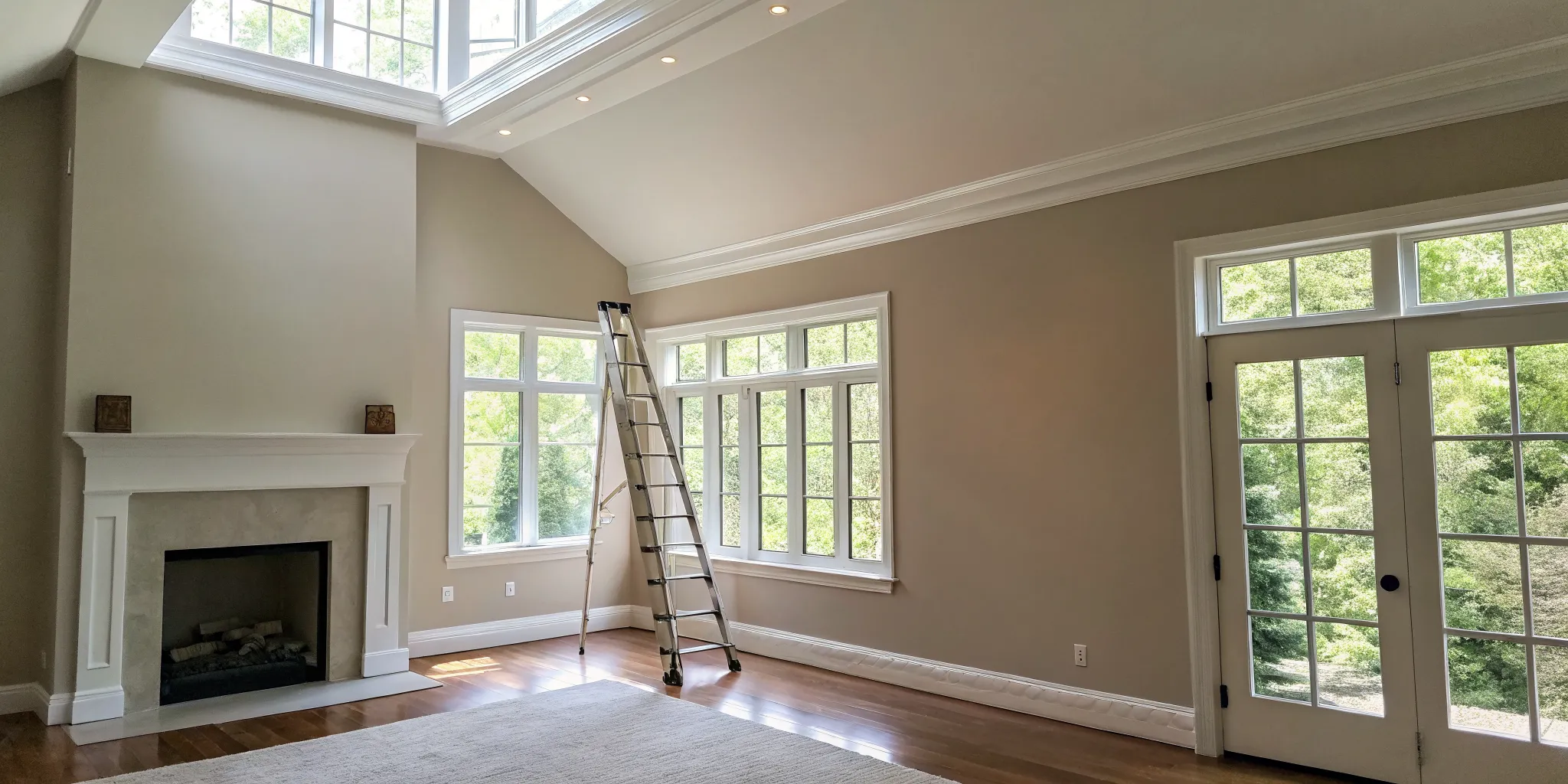
Step 2: Prep Your Room Like a Pro
Proper preparation is the single most important step for a beautiful paint job. Start by clearing the room of as much furniture as possible. For larger items you can’t move, push them to the center of the room and cover them completely with drop cloths. Don’t forget to cover the floors, too. Next, clean the walls and ceiling with a mild detergent to remove any dust, grease, or grime that could prevent the paint from adhering properly. Fill any nail holes or cracks with spackling paste, let it dry, and then sand it smooth for a seamless surface. Finally, apply painter’s tape along the trim, baseboards, and window frames for crisp, clean lines.
Step 3: Apply Paint with the Right Technique
With your room prepped, it’s time to paint. Start by “cutting in,” which means using an angled brush to paint along the edges of the ceiling, corners, and trim where a roller can’t reach. Once you’ve cut in a section, you can start rolling. “Load your roller cover with paint and run off the excess along your grid so it doesn’t drip.” To avoid streaks and lap marks, apply the paint in a consistent “W” or “M” pattern, working in small sections. This technique helps distribute the paint evenly for a smooth, uniform finish. Always maintain a wet edge by overlapping your strokes before the previous one dries.
Step 4: Always Paint from Top to Bottom
There’s a golden rule in painting: always work from the top down. This means you should paint your ceiling first, then move on to the walls. This simple strategy prevents any drips or splatters from the ceiling from ruining your freshly painted walls. Even when you’re using the same color for both, following this order ensures a cleaner process and a more professional outcome. It’s a fundamental practice that our house painters follow on every project, and it’s a big part of how we deliver on our service guarantee. By tackling the ceiling first, you can work efficiently and confidently, knowing you won’t have to do any frustrating touch-ups later.
Step 1: Plan Your Lighting and Budget
Before you get swept away by color swatches, take a moment to consider two practicalities: light and budget. The amount of natural light a room gets is a game-changer. A color that looks soft and dreamy in a sun-drenched, south-facing room can feel heavy and drab in a space with limited, cooler north-facing light. Spend a day observing how the light changes in your room to understand how your chosen color will truly behave. On the budget side, while a DIY project can seem cheaper, costs for quality paint, brushes, rollers, and other supplies add up. Be realistic about the investment. If you’re considering a professional job to ensure a perfect finish, options like our financing plans can make it easier to fit a high-quality project into your budget without compromise.
Step 2: Gather Your Tools and Supplies
There’s nothing worse than getting into your painting groove only to realize you’re missing something essential. A mid-project run to the hardware store kills your momentum. Before you start, gather everything you’ll need. This includes high-quality paint and primer, rollers with an extension pole (your back will thank you), a 2.5-inch angled brush for cutting in, painter’s tape, drop cloths, spackling compound, a putty knife, fine-grit sandpaper, and a bucket with some mild detergent for cleaning. Investing in good quality tools, especially brushes and rollers, makes a huge difference in the final finish. It’s one of the secrets to a professional-looking job—no shedding bristles or lint in your beautiful new paint.
Step 3: Prep Your Room Like a Pro
I can’t say this enough: proper preparation is the most important step for a flawless paint job. This is where you earn that smooth, professional finish. Start by moving as much furniture out of the room as you can. What’s left should be gathered in the center and covered completely with drop cloths, along with the floor. Next, give your walls and ceiling a good cleaning with a mild detergent to remove any dust or grime that could mess with paint adhesion. Fill any holes or cracks with spackle, let it dry completely, then sand it smooth. Finally, use painter’s tape to create crisp edges along your trim, windows, and baseboards. It feels tedious, but trust me, this meticulous work is what separates an amateur job from a professional one.
Step 4: Apply Paint with the Right Technique
With your room fully prepped, it’s finally time for the fun part. The key to a smooth, even coat is to work methodically. Start by “cutting in,” which means using your angled brush to paint a 2-3 inch strip along the ceiling line, in the corners, and around trim—anywhere a roller can’t easily reach. Once you’ve cut in a section, switch to your roller. Load it with paint, but don’t oversaturate it. Roll off any excess on the textured part of your paint tray. To avoid streaks, apply the paint in a large “W” or “M” pattern, then fill it in with straight, parallel strokes. Always keep a “wet edge,” meaning you should overlap your new strokes with the still-wet paint from the previous section for a seamless blend.
Step 5: Always Paint from Top to Bottom
Here’s a golden rule that every professional painter lives by: always work from the top down. That means you paint the ceiling first, then the walls, and finally the trim. This simple order of operations saves you from a lot of frustration. Gravity is not always your friend in painting, and drips and splatters are inevitable. By painting the ceiling first, any stray drops will land on unpainted walls or taped-off trim, so you won’t have to worry about ruining a freshly painted surface. It’s a fundamental practice our house painters use on every single project, and it’s a key part of how we deliver on our service guarantee. This ensures a clean, efficient process and a beautifully finished room without any messy corrections.
DIY vs. Hiring a Pro: Which Is Right for You?
Deciding to paint your walls and ceiling the same color is exciting, but the next big question is who will do the work. While tackling a painting project yourself can feel empowering, a technique like color drenching requires a steady hand and a lot of patience to get right. The choice between DIY and hiring a professional often comes down to balancing your budget, your timeline, and the quality of the finish you’re hoping for.
Before you grab a roller, it’s worth thinking about what the project truly involves. It’s more than just a weekend task; it’s an investment in your home’s atmosphere. Let’s break down the pros and cons to help you decide which path is the right one for you.
When It Makes Sense to DIY
Going the DIY route is a great option if you have a smaller, straightforward room and, most importantly, plenty of time. A successful paint job is all about the prep work, and it almost always takes longer than you think. You’ll need to set aside time to clear the room, clean the walls, patch any holes, tape off edges, and apply primer.
Once you start painting, you have to account for drying time between coats and the final cleanup. If you’re a patient person who enjoys detail-oriented work and isn’t on a tight deadline, a DIY project can be incredibly rewarding. Just be realistic about the commitment required to achieve a smooth, professional-looking finish.
The Perks of Hiring a Professional
If your time is limited or you’re feeling a bit intimidated by the scope of the project, hiring a professional is a smart move. Painters bring a level of skill that’s hard to replicate. They understand that proper preparation is the key to a beautiful and durable result. They know how to handle tricky spots like high ceilings, corners, and trim with precision, ensuring clean lines and an even coat.
Professionals also have all the right tools and techniques to work efficiently without sacrificing quality. They can complete the job much faster than the average homeowner and handle the entire cleanup process. When you invest in expert interior painting, you’re not just paying for paint on the walls; you’re paying for expertise, peace of mind, and a flawless finish.
Weighing the Cost Against the Long-Term Value
The upfront cost of hiring a professional painter is higher than doing it yourself, but it can be a better investment in the long run. A common DIY mistake is underestimating the project, which can lead to wasted paint, messy results, and the need to hire a pro to fix it anyway. This ends up costing you more time and money.
Professionals also provide valuable guidance on color and finish. They know that colors can look completely different on a wall than they do on a paint chip, and they can help you sample shades in your space to see how the light affects them. A high-quality paint job adds real value to your home, and a professional’s work is backed by experience and often a service guarantee, ensuring the results will last for years.
Related Articles
Frequently Asked Questions
Will color drenching make my room feel too dark or small? Not at all, as long as you choose your color wisely. The effect really depends on the room itself. A deep, rich color can create a wonderfully cozy and dramatic atmosphere in a space with plenty of natural light or high ceilings. If you’re working with a smaller room or one that doesn’t get much sun, sticking to lighter shades will create that open, expansive feeling you’re looking for. It’s all about balancing the color’s intensity with the room’s natural features.
Can I use different paint finishes for the walls, ceiling, and trim? Yes, and you absolutely should. Using the same color but varying the sheen is a professional trick that adds subtle depth and sophistication. A great combination is a flat finish for the ceiling to hide imperfections, an eggshell or satin finish on the walls for durability, and a semi-gloss finish on the trim and doors. The slight shine on the trim will catch the light and define the room’s architecture without breaking the single-color look.
Is this technique a good idea for every room in the house? Color drenching is incredibly versatile, but it works best in rooms with clear, defined boundaries like bedrooms, home offices, or dining rooms. In these spaces, it creates a powerful, immersive mood. It can be a bit trickier to pull off in large, open-concept living areas because it’s hard to find a natural starting and stopping point for the color, which can disrupt the seamless effect.
What if I have textured ceilings? Will this technique still work? It certainly can. In fact, painting the ceiling the same color as the walls can help camouflage the texture by creating a more uniform appearance. The key is to use a completely flat or matte paint finish on the ceiling. These low-sheen finishes absorb light, which helps to soften the appearance of the texture and makes it much less noticeable than it would be against a contrasting white ceiling.
How do I keep a single-color room from looking flat or boring? This is a great question. The secret to a dynamic color-drenched room is texture. Since the color is uniform, your furniture, textiles, and decor become the main focus. Layer in different materials like a plush rug, velvet curtains, wood furniture, and metallic accents. Varying the paint sheen, as mentioned earlier, also adds a layer of visual interest that keeps the space from feeling one-dimensional.