Deciding to paint your house is exciting, but figuring out where to start with colors can feel paralyzing. Should you go light or dark? How do you work with your existing roof color or stonework? What about the trim? If these questions are making you second-guess the whole project, you’re in the right place. This guide provides a simple, step-by-step process for choosing the perfect exterior paint color. We will walk you through everything from finding inspiration and understanding color palettes to testing samples correctly, taking the guesswork out of the process so you can feel confident and excited about your decision.
Picking an exterior paint color for your house can feel overwhelming. The options seem endless and it’s hard to narrow down on a color scheme when you don’t know what you should be looking for. The interior of your home is where you can flex your personality and use your personal color preference while the exterior paint should be more about durability. You want paint that will last! As you consider paint colors for your home’s exterior, stick with what you know and love! This is your largest investment and by choosing colors that look good and last longer you’re going to be doing more than just protecting your house, your increasing its value and stretching your dollar!
Start with the Basics: Light, Dark, or In-Between?
First things first, decide what color tone you want. Do you want something light and bright, mid-tone, or dark for the body of your house? This is the easy part as most of us have some sort of vision that leans light or dark.  Light Tones would include all your earthy colors like white, beige, brown, and tan. These colors absorb lese UV rays which means your house stays cooler and is less likely to fade as compared to organic colors like reds, blues, greens and yellow.
  Mid-tones are the ones in the middle of the spectrum and they are neither dark or light. These colors may appear muted or slightly dull but are easy on the eyes. They aren’t as flirty as pastels, overwhelming as bright colors or dramatic as dark ones. Examples would be blue gray, peach, sage, or hay yellow.
 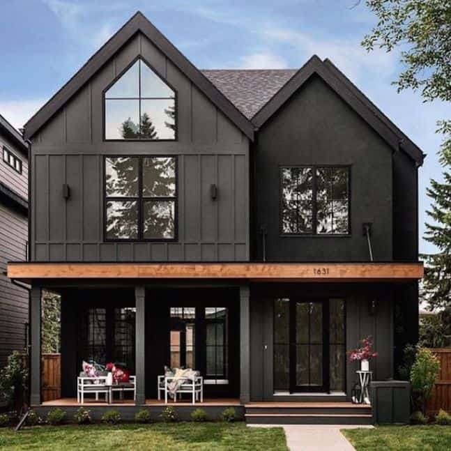 Some Dark tones would include black, charcoal gray, navy, dark forest green and dark violet. Dark exteriors are perfect for homes surrounded by beautiful greenery. The contrasts in tones are a sure-fire way to make your house stand out. While these aren’t the most popular exterior color due to it’s inevitable fading, dark colors are sophisticated, elegant, modern and edgy. If a dark color scheme seems a bit much, consider just painting your front door a bold dark color.
Popular Exterior Paint Colors and Trends
Once you’ve decided on a general direction—light, dark, or somewhere in the middle—it’s time to look at specific colors. Trends are always changing, but some colors have serious staying power. Choosing a popular, well-loved color is a great way to ensure your home looks stylish for years to come. It’s also a smart move for resale value. As professional house painters in the Boise area, we’ve seen firsthand which colors stand the test of time and which ones make homeowners happiest. We can help you find the perfect shade that not only looks fantastic but also holds up to the Idaho climate. Let’s look at some of the most popular and enduring exterior paint colors that work beautifully on a variety of homes.
Timeless Neutrals and Whites
You can never go wrong with a classic. Timeless neutrals and whites are consistently the most popular choices for home exteriors, and for good reason. They offer a clean, crisp look that makes your home feel fresh and inviting. These shades are incredibly versatile, complementing nearly any architectural style, from a modern new build to a historic home in the North End. A fresh coat of a beautiful white or a soft neutral can also make your property appear larger and brighter. It’s a simple change that provides a major impact on your home’s curb appeal, creating a welcoming canvas for landscaping and accent colors.
Sherwin-Williams Alabaster and Agreeable Gray
Two of the most requested colors we see are from Sherwin-Williams. Alabaster is not your average white; it’s a soft, creamy off-white that brings warmth and light to an exterior without feeling stark or cold. It’s a perfect choice for a main body color that feels both classic and cozy. On the other hand, Agreeable Gray is the king of “greige” (a mix of gray and beige). This chameleon-like color works with both warm and cool accent tones, making it one of the most versatile and safest bets for any home. It provides a neutral backdrop that is sophisticated and anything but boring.
Benjamin Moore White Dove and Revere Pewter
Benjamin Moore also offers some of the most beloved neutrals on the market. White Dove is another fan-favorite soft white that’s celebrated for its gentle, luminous quality. It’s a popular choice for both siding and trim because it pairs beautifully with almost any other color. Then there’s Revere Pewter, a light gray with warm undertones that adds a touch of timeless elegance. It’s a bit deeper than many other neutrals, giving it a substantial feel that can ground a home’s exterior design. Both of these colors are go-to choices for a sophisticated and enduring look.
Bold and Moody Hues
If you’re looking to make a statement, a bold and moody exterior might be the perfect fit. Darker colors like deep charcoal, black, and rich navy have become increasingly popular for homeowners who want a modern and dramatic look. These shades create a powerful visual contrast, especially when paired with light trim, natural wood, or stone accents. While it’s a braver choice, a dark exterior can feel incredibly sophisticated and unique. Applying these deep colors requires a steady hand and an expert technique to avoid imperfections, which is why trusting a professional for your expert exterior painting project is key to achieving a flawless finish.
Sherwin-Williams Tricorn Black and Iron Ore
For those ready to embrace the dark side, Sherwin-Williams has some incredible options. Tricorn Black is a true, deep black that is unapologetically bold. It creates a striking, high-contrast look that is both modern and timeless. If a true black feels a bit too intense, consider Iron Ore. This is a very dark charcoal gray that reads almost black in some lighting but has a slightly softer feel. It delivers a similar level of drama and sophistication while being a touch more forgiving. Both colors make a stunning impact and are sure to turn heads.
Behr Espresso Beans
If you love the moody trend but prefer warmer tones, a rich brown could be the answer. Behr’s Espresso Beans is a deep, dark brown that feels warm, inviting, and luxurious. This color provides the same dramatic effect as a black or charcoal but with an earthy, organic feel. It pairs beautifully with cream-colored trim and natural elements like stone and greenery, creating a look that is both grounded and sophisticated. It’s a fantastic way to achieve a bold exterior that still feels welcoming and connected to the natural landscape.
Earthy and Grounded Tones
Drawing inspiration from the natural world is a trend that never goes out of style. Earthy tones like muted greens, warm browns, and rich, clay-inspired hues help your home blend seamlessly with its surroundings. This is an especially beautiful approach for homes in the Boise area, where we’re surrounded by the beauty of the foothills and the river. These colors evoke a sense of calm, stability, and tranquility. Choosing an earthy color for your exterior creates a peaceful and harmonious vibe that feels both organic and intentional, connecting your living space to the landscape around it.
Sherwin-Williams Urbane Bronze
Named Sherwin-Williams’ Color of the Year in 2021, Urbane Bronze is a perfect example of a sophisticated earth tone. It’s a rich, deep color that sits somewhere between a dark gray and a warm brown. This complexity allows it to feel both modern and rooted in nature. Urbane Bronze is a dramatic hue that pairs exceptionally well with lighter trim colors and natural materials like wood and stone. It’s a color that feels strong and serene at the same time, making it a fantastic choice for a grounded, contemporary exterior.
Behr Hidden Forest
For those who want to incorporate green in a subtle and sophisticated way, Behr’s Hidden Forest is an excellent choice. This is a muted, mid-tone green with gray undertones that prevents it from feeling too bright or overwhelming. It evokes the calming feeling of a walk in the woods and helps a home settle beautifully into a landscape with lots of trees and greenery. This color brings a sense of tranquility and renewal, offering a touch of color that is both refreshing and timeless. It’s a wonderful way to connect your home to its natural surroundings.
Work With What You’ve Got: Your Home’s Existing Features
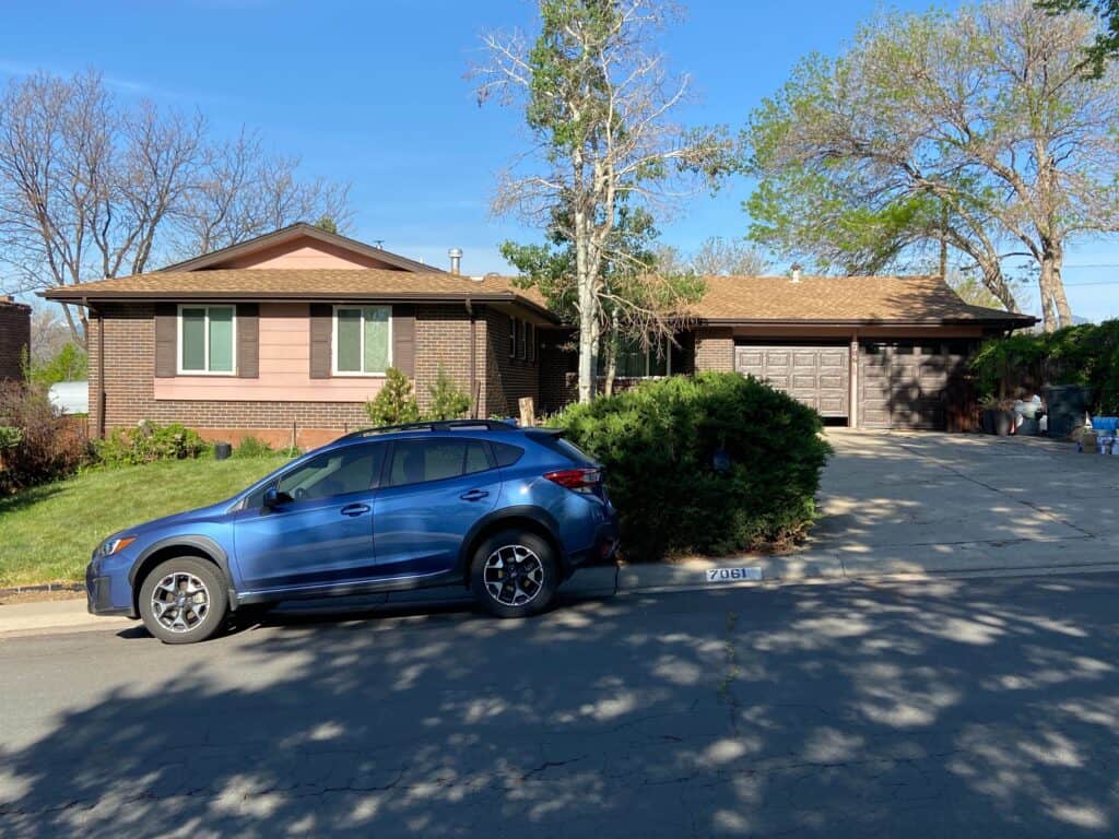
Look at your home and take note of it’s personality and its surroundings! Do you have interesting architecture features you want to highlight? Is there existing stone or brick that you are keeping? Do you have a lot of colorful plants and shrubbery? What about the color of your roof? Think about working with the underlying colors within that material and stay away from ones that will clash. 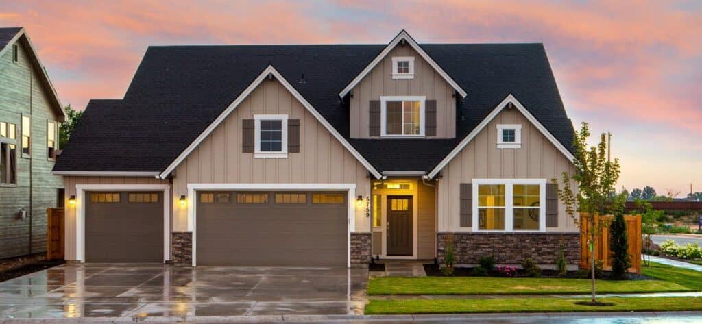 What are underlying colors exactly? We have three primary colors, red, yellow and blue. All other colors are combinations of those mixed together. Tone is related to the amount of black or white within the color. Let’s say you have a house with browish stone like the one pictured above. You can see that while the stone comes off as brown, it is compiled of a handful of colors like black, tan and cream. Those would be considered the materials underlying colors. Knowing that, you can then pull colors with the tone you are looking for to perfectly compliment your already existing material. Some examples of colors that will clash with each other are: Red and purple. Brown and maroon. Brown and Black. Orange and Purple. Blue and Green. A good example of this would be, if you have a brown roof with green undertones you should stay away from painting your home blue!
Creating a Cohesive Color Scheme
Once you’ve considered your home’s fixed elements, the next step is to build a balanced color palette. A well-thought-out scheme brings harmony to your home’s exterior and gives it a polished, intentional look. Instead of getting lost in endless color chips, start with a simple structure. This approach helps you narrow down your choices and ensures the final result looks cohesive and professional. Think of it as creating a simple recipe with three main ingredients: a primary color for the body, a secondary color for the trim, and a pop of an accent color.
The Three-Color Palette Rule
A tried-and-true guideline for exterior design is the three-color rule. Most professionally painted homes use a palette of three to four distinct colors to create depth and interest. The first color is your main field color, which covers the largest surface area, like your siding. The second is the trim color, used for features like window and door frames, fascia, and roof edges. The third is an accent color, which provides a fun pop on shutters, the front door, or other small architectural details. This simple framework prevents the design from looking too busy or too flat.
Color Combination Examples
To see the three-color rule in action, look at some classic combinations. A popular and timeless choice is using a greige like Benjamin Moore’s Revere Pewter for the main body, a soft off-white like Swiss Coffee for the trim, and a deeper, grounding gray like Copley Gray for the front door or shutters. Another beautiful option is a crisp white body, black trim for a modern farmhouse feel, and a natural wood tone for the front door accent. These examples show how a structured palette creates a complete and appealing look for your home’s exterior.
Choosing the Right Paint Finish for Durability
Selecting the right color is only half the battle; the paint’s finish, or sheen, is just as critical for the longevity and appearance of your home’s exterior. The finish determines how the paint reflects light, how durable it is, and how easily it can be cleaned. In a place like Boise, with hot, dry summers and cold, snowy winters, choosing a durable finish is key to protecting your investment. The right sheen will help your home withstand moisture, UV rays, and daily wear and tear. An expert exterior painting professional can help you select the perfect finish for each surface, ensuring your home looks great for years to come.
Flat or Matte Finish
A flat or matte finish has no shine, which gives it a modern, velvety appearance. Its biggest advantage is its ability to hide imperfections like bumps, cracks, or uneven texture on older siding. However, this lack of sheen comes with a trade-off. Flat finishes are more porous, making them less durable and more susceptible to scuffs, stains, and moisture. Cleaning them can be difficult, as rubbing the surface can leave marks. Because of this, flat paint is generally better suited for low-traffic areas or historic homes where preserving texture is a priority.
Satin or Eggshell Finish
Satin and eggshell finishes are the most popular choices for exterior painting, and for good reason. They offer a perfect middle ground with a low-lustre sheen that’s more durable and easier to clean than a flat finish. This slight shine provides excellent resistance to moisture and stains, making it ideal for the main body of your house. A satin finish subtly reflects light, which can help bring your chosen color to life without being overly glossy. It’s a versatile and practical option that delivers both beauty and performance for most house painters and homeowners.
Semi-Gloss and High-Gloss Finishes
When it comes to trim, doors, and shutters, you need maximum durability. Semi-gloss and high-gloss finishes are the toughest options available. Their smooth, shiny surface creates a hard, protective shell that stands up to the elements, resists moisture, and is incredibly easy to wipe clean. This makes them perfect for high-touch areas like railings and front doors. Aesthetically, using a glossier finish on your trim creates a crisp, clean contrast against the lower-sheen paint on your home’s body, making architectural details pop and giving the entire paint job a professional, finished look.
Where to Find Exterior Paint Color Inspiration
At this point, if your home has underlying colors within existing material that you like and are drawn to, your decision should be pretty easy from here. If you have an HOA with pre-approved colors then simply look for a scheme that has the right tones you are looking for and then match the colors as closely as you can. Don’t worry if you are still lost at this step. Do some research! Look at your HOA color schemes and browse Pinterest or Google for inspiration. Try searching phrases based off the style of your house like, “ranch style home exterior” or “Victorian home exterior.” You can also try searching terms like “light house exteriors” or “Dark exterior houses.” 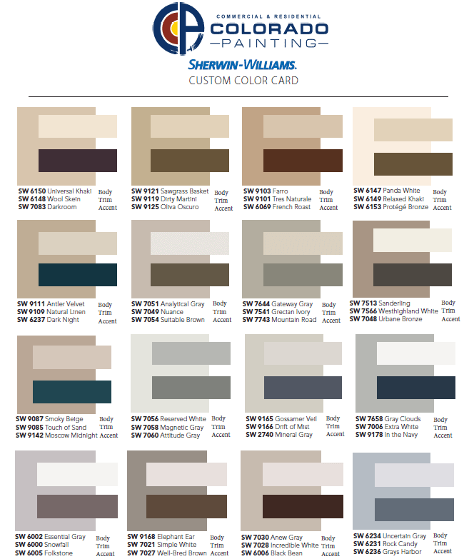 Check out our Pinterest board for inspiration or some of our custom color schemes above!
Using Digital Color Tools and Resources
If browsing Pinterest leaves you with more questions than answers, it might be time to try a more hands-on approach. Major paint brands have developed some amazing digital tools that let you “try on” colors before you commit. This takes a lot of the guesswork out of the equation and helps you visualize the final product on your own home, not just a pretty picture online. It’s a great way to build confidence in your color choices. Once you have a few shades you love, the next step is to see them in the real world. Our team of expert exterior painters can apply samples to your home so you can see how the colors look in different lighting throughout the day.
Behr’s COLORSMART and COLOR DISCOVERY Tools
Behr has a couple of incredibly helpful tools to make your color selection process smoother. Their COLORSMART tool is a game-changer because it lets you upload a photo of your own house and digitally paint it with different colors. You can see exactly how that trendy dark gray or classic white will look on your specific home. They also offer a COLOR DISCOVERY tool, which helps you find colors based on the mood you want to create. It’s a more intuitive way to find a palette that truly feels like you, simplifying the decision and making the whole process feel less overwhelming and more creative.
Sherwin-Williams’ #SWColorLove and Real Home Galleries
Sometimes the best inspiration comes from seeing what other real homeowners have done. Sherwin-Williams taps into this with their community-focused resources. You can browse their Real Home Galleries to see actual houses painted in various Sherwin-Williams colors, which is perfect for getting a sense of how a shade looks in a real-world setting. They also have the #SWColorLove hashtag on social media, where people share their own painting projects. It’s a fantastic way to see a wide range of color combinations on different styles of homes and discover a look you might not have considered before.
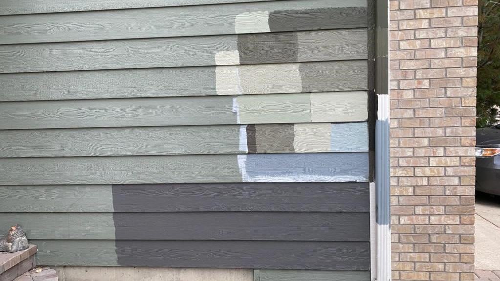
Test Your Colors Before You Commit
You have finally narrowed down on a color scheme or two. Now it’s time to get samples! Expect that your color will look a tone lighter than what you see on the color chip. Paint tends to look lighter when exposed to natural light. When painting up your samples, do it in several areas around the house and look at them at different times during the day so you can see it’s true color. If you have a stucco home, the paint may look a little darker because the texture creates shadows within the small indentations. If your home is made of both stucco and siding, consider painting them the same color. The texture and slight difference of tone will give your exterior depth. With natural light also comes more color. Once you paint those samples up you’re going to be able to see more of it’s underlying colors. Gray’s may look more purple or blue. Tan may seem a little more orange. Keep this in mind when picking colors and if you are worried about those colors coming through opt for a lighter tone within the same color family. 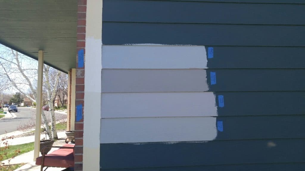
 DO: Paint up samples once you have narrowed in on your final exterior colors DONT: Waste your money and paint up a ton of different exterior color options Try to wait until you’ve narrowed down your colors before you go painting up a bunch of different ones. Samples should be you narrowing in on a color, not painting up a dozen different ones to see what you like best. With sample cans running close to $10 a pop that ends up being a major waste of money. If you are a visual person and you can’t help but want to see a bunch of colors on the home, try using Sherwin-Williams COLORSNAP Visualizer. This application lets you upload a photo of your home and see it painted as another color.
How to Properly Test Paint Samples
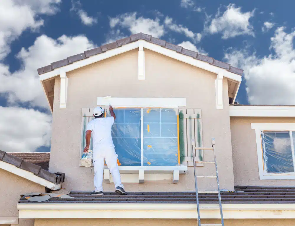
Once you’ve narrowed down your choices, it’s time to sample. This is the most important step, so don’t skip it! Paint colors can look dramatically different on a large surface in natural light compared to a small chip in a store. As paint experts at Sherwin-Williams advise, you should always paint a two-foot by two-foot section and observe it at different times of the day. The way the color looks in the bright morning sun will be completely different from how it appears in the soft evening light or on a cloudy Boise day. This simple test helps you see the color’s true character and its undertones, ensuring you won’t have any regrets after committing to gallons of paint. It’s a small investment of time and money that prevents a much larger, more expensive mistake.
Considering Your Neighborhood and Resale Value
While your personal taste is important, it’s also wise to consider your home’s surroundings and its future resale value. Take a walk or drive around your neighborhood. What colors are common? Choosing a scheme that complements the area while still reflecting your style is a safe bet. Most homes use a three-to-four color palette for the body, trim, and accents like shutters or the front door. This creates a cohesive and polished look. A well-chosen color scheme not only makes you happy to come home but also enhances curb appeal, which is a huge factor for potential buyers. If you’re thinking about selling in the next few years, a classic, neutral palette is often the most strategic choice for attracting a wide range of buyers. Our professional house painters can help you select a palette that looks great today and pays off tomorrow.
Understanding Paint Quality and Special Features
It’s easy to think that all paint is the same, but the quality of the paint you choose is just as important as the color. Higher-quality paint offers better coverage, which can mean fewer coats and less labor. More importantly, it provides superior durability, adhesion, and resistance to fading, cracking, and mildew. Think of it as a protective shield for your home’s exterior. Investing in a premium paint product now can save you from having to repaint in just a few years. At Boise Commercial & Residential Painting, we believe in using top-tier materials because we know it delivers a finish that not only looks beautiful but also lasts. Our commitment to quality is a core part of who we are and allows us to offer a service guarantee you can trust.
Paint Product Tiers Explained
Paint manufacturers typically offer several product lines at different price points, often categorized as “good, better, best.” The “good” tier is usually a budget-friendly option suitable for low-traffic areas or situations where longevity isn’t the primary concern. The “better” and “best” tiers are where you’ll find significant improvements in performance. These premium paints contain higher-quality resins and pigments, which translate to better color retention, enhanced durability against the elements, and a smoother application. For example, many premium exterior paints, like those from Behr, include a primer in the formula, which can save a step and improve adhesion. When you invest in expert exterior painting, you’re also investing in the superior protection these top-tier products provide for your home.
Innovative Paint Technologies
The world of paint has come a long way, with new technologies designed to make paint last longer and perform better. One of the most popular innovations is the “paint-and-primer-in-one” formula, which helps the paint adhere to surfaces more effectively and cover old colors with ease. You can also find paints with advanced UV protection to fight fading from the strong summer sun, as well as mildew-resistant additives that are perfect for shaded, damp areas of your property. Some high-end paints even have “self-cleaning” properties, using the power of rain to wash away dirt and keep your home looking fresh. Understanding these features can help you choose a product that is perfectly tailored to your home’s specific needs and Boise’s unique climate.
Tips for Specific Exterior Projects
You don’t always need to paint your entire house to give it a fresh new look. Focusing on smaller, high-impact areas can make a huge difference in your home’s curb appeal. Projects like painting your front door, shutters, or trim are fantastic ways to add a pop of color and personality without the time and expense of a full exterior repaint. These smaller projects are also a great way to experiment with bolder colors you might not want for your entire house. Whether you’re looking to add a touch of modern flair or restore the classic charm of your home, a few well-placed coats of paint can work wonders. It’s about working smarter, not harder, to get a look you love.
Updating Your Front Door
If you’re looking for a quick and satisfying weekend project, look no further than your front door. As Sherwin-Williams notes, “Painting your front door a bright color is an easy way to update your home’s look.” A bold, welcoming front door can completely change the feel of your home’s entrance and serve as a beautiful focal point. Colors like a cheerful yellow, a classic navy, or a sophisticated black can add instant personality. Before you start, make sure to properly clean and sand the door for the best adhesion. For a flawless, professional-looking finish that will stand up to daily use, consider hiring our team of expert painters to get the job done right.
Painting Decks and Wood Siding
Wood surfaces like decks, fences, and siding require special attention to protect them from moisture, sun, and foot traffic. The key to a long-lasting finish on wood is meticulous preparation. This means thoroughly cleaning the surface to remove dirt, mildew, and old, flaking paint, followed by sanding to create a smooth base for the new coat. For decks, you’ll want to choose a durable product specifically designed for horizontal surfaces that can withstand weather and wear. For siding, a high-quality exterior paint will provide the best protection. Whether you choose a solid paint or a semi-transparent stain, using the right product is crucial for preserving the beauty and integrity of the wood. This is a core part of our expert exterior painting services.
When Is the Best Time to Paint Your Exterior?
Timing is everything when it comes to exterior painting. For paint to cure properly, you need a string of mild, dry days. Extreme temperatures, both hot and cold, as well as high humidity and rain, can ruin a paint job. Here in Boise, the ideal painting season typically runs from late spring through fall. The dry, warm summer months are popular, but don’t discount the fall. As one industry source points out, “October has many warm dry sunny days… it is therefore alright to paint outside in October.” The key is to find a window where nighttime temperatures will stay consistently above 40-50°F (depending on the paint’s specifications) to allow for proper curing. Because the ideal painting season is limited, professional painters get booked up quickly. We recommend planning your project in advance and contacting us to get on the schedule.
Ready to Make the Final Call?
Stick with the colors and tones you know and love and if you ever need some advice, your friends here at Boise Commercial & Residential Painting would be happy to assist you! Learn more with our guide on some of the best exterior paints for your home.
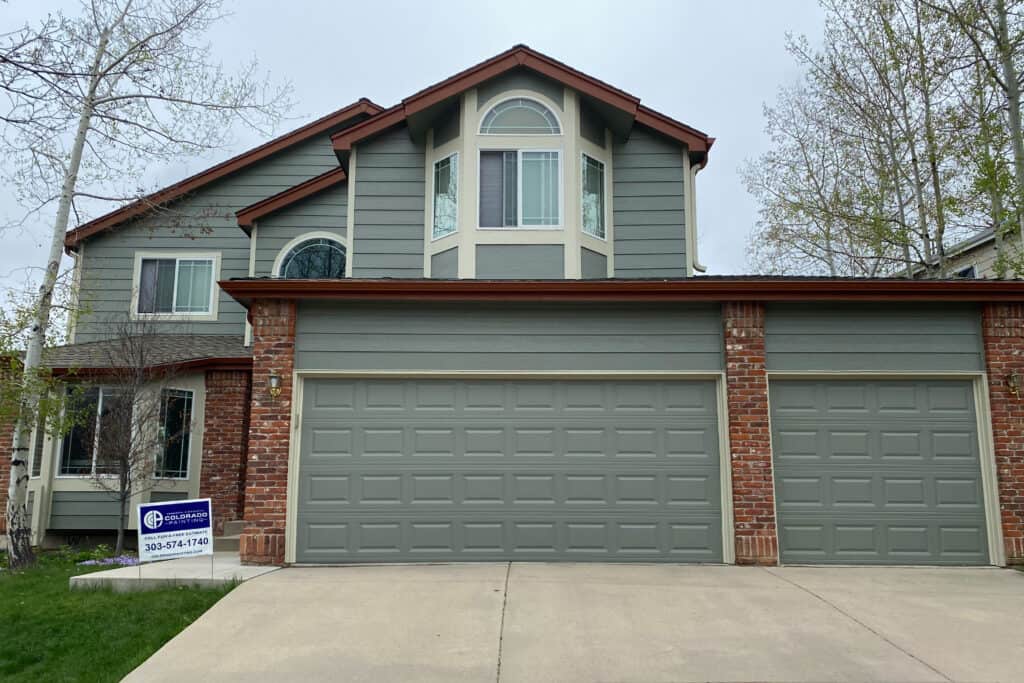
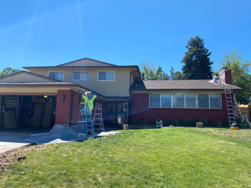
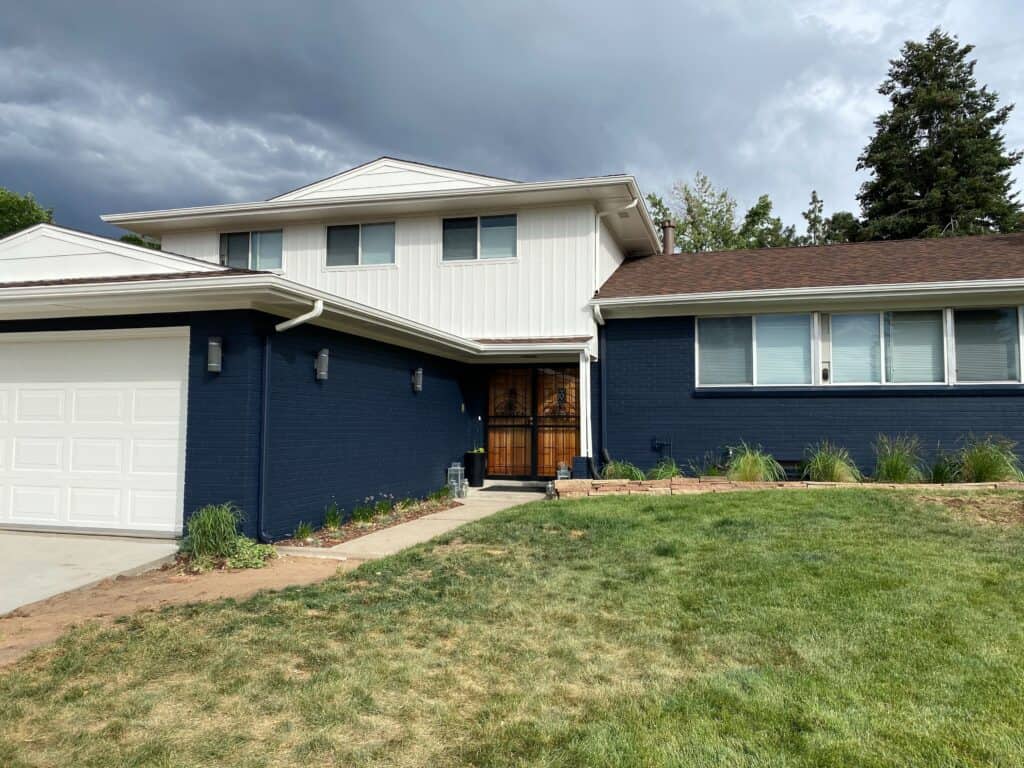
Before and After: Exterior Paint Makeovers
Frequently Asked Questions
How do I choose a paint color that won’t clash with my brick or stone? Start by identifying the underlying colors in your home’s fixed features, like brick, stone, or even your roof. These materials are rarely one solid color; they often have flecks of tan, gray, cream, or black. Pulling one of these subtle colors for your main paint color is a great way to create a cohesive look. For example, if your stone has hints of gray, a greige or charcoal body color will likely look fantastic.
I’m worried about picking a color that will fade quickly. What should I avoid? Generally, darker and more vibrant colors (like deep reds, blues, and blacks) absorb more UV rays, which causes them to fade faster than lighter colors. If longevity is your top priority, light neutrals like whites, beiges, and light grays are your safest bet. They reflect more light, which helps them retain their color longer and can even keep your house slightly cooler in the summer.
What’s the difference between satin and semi-gloss paint, and where should I use them? The main difference is the amount of shine. Satin has a low, subtle luster, while semi-gloss is noticeably shinier. For the main body of your house, a satin finish is usually perfect because it’s durable and easy to clean without being too reflective. For trim, doors, and window frames, semi-gloss is the better choice. Its higher shine provides extra durability for these high-touch, high-exposure areas and creates a crisp, professional-looking contrast.
How many paint colors are too many for a house exterior? A good rule of thumb is to stick to a three-color palette. This typically includes a main color for the body of the house, a secondary color for the trim, and an accent color for details like the front door or shutters. This simple structure provides enough variety to create depth and interest without making the design look too busy or disjointed.
Why is it so important to test paint samples on my actual house? A small paint chip from the store can look completely different once it’s on a large wall in natural light. Testing a large sample (about two-by-two feet) on your house lets you see how the color changes throughout the day with the shifting sun. It also reveals the color’s true undertones, which can be hard to see in a store. This step is the best way to prevent costly surprises and ensure you’ll love the final result.
Key Takeaways
- Work with your home’s fixed features: Before choosing a color, look at the elements you aren’t changing, like your roof, stonework, or brick. Use their underlying tones (for example, the grays or tans in your stone) to guide your paint selection for a naturally cohesive look.
- Follow the three-color palette rule: A professional paint job typically uses three colors: a main color for the body, a secondary color for the trim, and an accent color for the front door or shutters. This simple structure adds depth and visual interest without overwhelming the design.
- Test samples the right way: Paint chips are not enough. Once you have a few final choices, paint large two-foot by two-foot samples on your house. Check them at different times of day to see how the color and its undertones appear in various natural light conditions before you commit.